-
-
Open Source Ideas
All too often, I have ideas which might make a cool website or iPhone app or whatever and I know I just don't have the time to build them. I'm going to post them here in the hope that someone else might find a use for them. These ideas might already be in existence, of course. I'm not claiming they are unique in any way (although some might be).
You are free to take these ideas and do whatever you like with them. Of course, if they become amazingly successful, I could do with a bigger TV...
-
SpreadShop
If you wake up every morning and think, "My t-shirts are so dull, I wish I had interesting clothes...", you need to have a look at my online shop.
-
Crowdsourced Weather - Part 2
So, I couldn't help myself. I had a niggling idea at the back of my head that I needed to get out. After coming up with this Twitter weather idea last week, I decided to spend a couple of hours this weekend building it. As if I didn't have other things I should have been doing instead...
It works pretty much exactly how the pseudocode I mentioned last time describes. Every few minutes, a script will search Twitter for mentions of any weather words from several different languages. It will then look up the location of the person who tweeted that and store it. Single reports might be wrong and users might not have stored their actual location but over a large enough sample, this system becomes more accurate. The script removes any matching twets older than 6 hours.
To display, I actually ended up using Geohashes instead of Geotudes because it is easier to simplify them when you zoom out just by cutting off the tail of the hash. For example, the physical area denoted by gcvwr3qvmh8vn (the geohash for Edinburgh) is contained within gcvwr3 which is itself contained within gcv. There are a few technical problems with geohashes but it seems the best fit for this purpose. If anyone knows of any better suggestion, please let me know. I do realise that this is quite possibly the slowest, most inefficient JavaScript I've ever written because it makes an AJAX call for every graticule and it probably should just send the South-East and North-West bounds and get back an array of them but, like I said, there were other things I should have been doing. Because the overlaid grid changes resolution based on zoom level, there are a few places where it is either tragically slow (resolution too fine) or terribly inaccurate (resolution too rough). That's just a case of tweaking the algorithm. Similarly, it's set to display reports of weather if there are 2 or more matches but it could be tweaked to only show if a larger number have reported something.
So go, play with the Twitter-generated weather map. If someone can come up with a good, catchy name, or some better graphics, that'd be great, thanks.
-
Crowdsourced Weather
This is a more general version of the #uksnow map idea. It's a crowd-sourced weather map which relies on the fact that any one individual tweet about the weather might be inaccurate but given a large enough sample, enough people will mention the weather in their area to make this a workable idea. It doesn't require people to tweet in a particular format.
To get info
Have an array of weather words in various languages (rain, hail, snow, schnee, ame, yuki)
every 5 minutes:
	foreach weatherword
		search twitter for that word
			http://search.twitter.com/search.atom?q=rain
		retrieve latest 100 tweets
		foreach
			get user info
				http://twitter.com/users/show.xml?screen_name=username
			get user.location if available
			geocode
			save:
				username, time, lat, long, geotude, weatherword
		Remove any tweets about this weatherword older than 6 hours.
To display info
Show a Google map
Based on current Zoom level, split the current map into about 100 geotudes
foreach geotude
	search database for any weather results for that block (probably using an ilike "1234%" on the geotude field)
	sort by weatherword count descending
	draw an icon on top of that block to show the most common weatherword

If the user zooms in, recalculate geotudes and repeat.
I quite like that this uses geotudes which I think are an excellent idea.
-
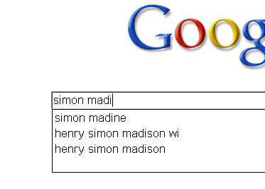
What's your Google Suggest number?
The next step in ego-googling: how many letters of your name do you need to type into the google search box before you are the top suggestion? The lower the better, obviously. Including spaces, My name is the top suggestion after 10 characters so I have a Google Suggest Number of 10. My darling wife (who has recently changed her name) has a Google Suggest number of ∞ as she can type in her whole name and Google doesn't suggest her.
Turns out somebody proposed this first over 5 years ago. Oh well. Nothing's new on the internet.
-
Side Tab
After reading Aza Raskin's post about Firefox moving its tabs down the side of the window, I decided to give it a go in Opera. It turns out to be very useful when you have a widescreen monitor. I usually end up with several dozen tabs open at once and it's much easier to be able to put them down the side in an area which is, for most websites at least, dead space. On the rare occasions I do find myself on a website which requires more than the 1470px horizontal space this gives me, I can just tap f4 and get my full 1650px back. As the window sidepanel also groups by window and lists all tabs open across all windows, I can keep them ordered thematically, too.
This arrangement definitely doesn't work, however, when you have a small screen. When I tried this on my netbook, I had to choose between losing half of my screen to the tab list or only being able to read the beginning of each page title, even if I only had one tab open.
-
Some simple tips
The views and opinions expressed within are not those of National Museums Scotland. This site is in no way affiliated with National Museums Scotland or the website www.nms.ac.uk
First of all, the disclaimer: I am not a designer. If I were to make claim to being anything creative it's an illustrator but there's a huge difference between the two (I've always said that an illustrator makes the thing to go on the t-shirt, the designer says where on the t-shirt it goes). Despite the recent trend for everyone to call themselves web designers, I'm still going to go by web developer. I make things.
Bearing that in mind, there are still quite a few web design and UX tips and techniques I've picked up along the way which can be applied to most sites and not interfere with the mysterious ways of designers.
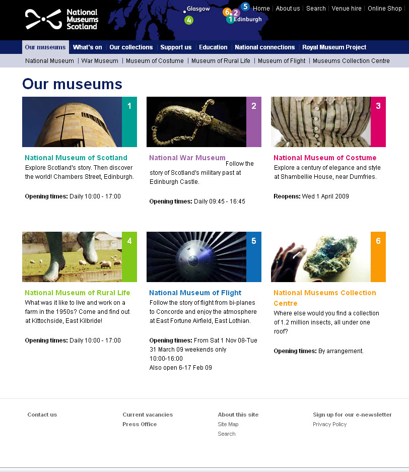
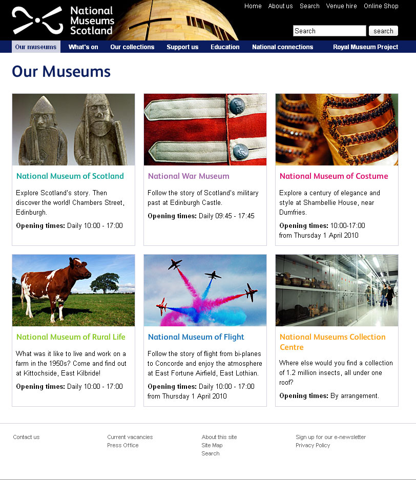
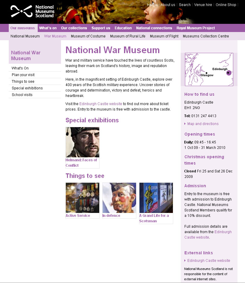
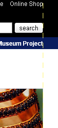
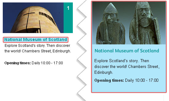
Recently, I've been reworking templates for National Museums Scotland for faster load times and better SEO and I'll illustrate what I'm talking about with a couple of examples from there. The brief on these templates is that the content can't really change and there are some chunks that the CMS generates which can't be changed. Note: the NMS templates are completely finished yet and those that are haven't been rolled out across the whole site but sticking with that whole release early, release often way of doing things, these little incremental improvements can be applied without affecting too much else.
For reference, here are before and after screen grabs of two of the templates.
Some people will find these tips blatantly obvious but the fact that pages still get made without considering these means they do need reiterating.
Link the Logo
The web's been around for a few years now and there are a few conventions users have gotten used to. One of them is that the logo is a link that takes you back to the home page. It doesn't harm anything to have a link there so even if 99% of visitors don't use it, why annoy the 1% who do?
Don't link to the search
From the moment the visitor decides they want to search your site for something, the most important thing is to get the results in front of them as quickly as possible. It therefore makes for a better experience if you bring the results one step closer to them. Rather than requiring the user to click on a link to get to the search form to do their search to get the results, put the search box on every page. They fill it in and go to the results page. If the user wants to take advantage of any advanced search features you may have, they can modify their search from the results page.

Line up
I'm sure there's more to design than this but there are a couple of well tested rules I recommend any non-designer to learn:
- If it doesn't line up, make it line up.
- If it's already lined up, make it not.
That and a subscription to iStock and you're done...
Make the hit area as big as possible
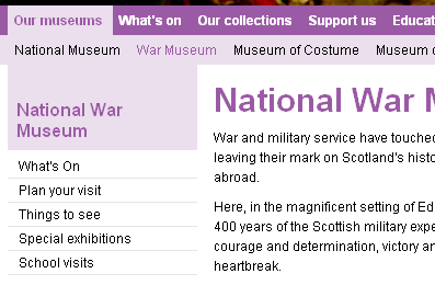
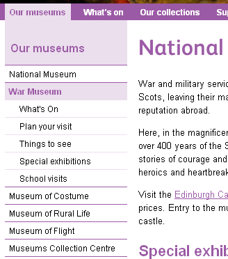
From the gateway page for Our Museums, there are two ways the user could go. They were either looking for opening times (in which case, they're done), or they want to find out more information about the individual museums on their own pages. To that end, it makes sense to make the next step as easy as possible and bascially turn the content this page into six huge buttons. To keep everything semantic, JavaScript has been used here to extract the destinations from each of the links and apply them to the whole panel area (it'll default to linked text and image with JavaScript disabled). As you can see, doing this changes the hit area for each museum from a line of text to a veritable barn door.
White text on a white background is not good
Actually, I'm not sure whether it's the fact that the link wasn't as readable as it could have been or the fact that to go home requires poking her in the eye that upset me most. Either way, if you do need to use an image that has a light bit underneath some light text and you can't shuffle it along like here, a quick wipe with the burn tool in Photoshop works wonders.
Underline links
I'm not going to get into the debate over whether or not designers hate underlines but for a high-traffic, public sector with an extremely varied demographic, I'd recommend using them. As Paul Boag mentions, what you do with your design and your solutions for various usability issues depends on the audience. A graphic designer's portfolio might very well eschew underlines when denoting links, a government site probably shouldn't. Especially when you remember that you should never rely on colour alone to convey information, including whether not a piece of text is a link.
Titles are titles of something
If you have a title, it generally refers to the thing below it, not the thing above it. Make sure you keep titles and the things they are titles of together.
Avoid disparate navigation
Again, another of the rules of web that has evolved over the last several years: Sections go along the top, navigation down the side. To keep consistent with the rest of the site the horizontal museum links were brought down and integrated with the rest of the navigation. This maybe isn't the most illustrative example but, basically, don't have a top nav, left nav, right nav and several others when you could have just one.
Only a fraction
There we are, a few handy little tips for your next build project. This hasn't gone into any issues of column width, line-height - or leading (pronounced /ˈlɛdɪŋ/) as designers call it, hover states or any of the myriad other things it could, just a few of the more important and easy-to-do ones.
-
Building an Objective-C growlView
Wherein our intrepid hero learns some Objective-C and figures out the easy bits are actually quite hard.
A couple of days ago, I decided to give myself a little software development task to write a Twitter Growl view. Growl is a centralised notification system for Mac OS X that lots of other applications can use so that there's one consistent way of showing notifications.
Background
The idea behind this little experiment wasn't to have tweets appear as growl notifications, there are already plenty of apps that do this, the idea was to have growl notifications sent to Twitter. Some friends have started organising a crowdsourced Friday afternoon playlist via Spotify and I thought it'd be handy if Spotify tweeted each song as it started. The easiest way I could think of doing this was to tap into the fact that Spotify sends a Growl notification on track start and get the Growl display plugin to tweet it as well [1].
Build
I downloaded the Growl Display Plugin Sample 1.2 [Zip - 186 KB] from the developer downloads page and the MGTwitterEngine library. I then downloaded Xcode so I could do the development. I have to point out here that this was my first foray into Objective-C programming and, indeed, my first attempt at anything vaguely C-related since I wrote a command-line calculator about 12 years ago. If I do it wrong, please forgive me.
The first thing to do was open the sample project in Xcode, figure out what files do what, etc. There is very little documentation on how Growl views or display styles work so I pretty much just spend an hour reading all the source from top to bottom. Here's a quick summary:
- Sample_Prefix.pch
- Pre-compiled header. Stuff that's included before every pre-compiled file
- Growl/
- Folder containing standard Growl stuff. Don't need to touch.
- GrowlSampleDisplay.h
- Header file, didn't need to change anything
- GrowlSampleDisplay.m
- Class for setting up things. Again, didn't touch [2].
- GrowlSamplePrefs.h
- Defining default preference values and naming functions to handle them. More on this later.
- GrowlSamplePrefs.m
- The actual functions mentioned in the previous header file
- GrowlSampleWindowController.h
- Not doing anything visual, really so I didn't need to mess around with this
- GrowlSampleWindowController.m
- As above
- GrowlSampleWindowView.h
- Declaring objects needed for execution
- GrowlSampleWindowView.m
- Instantiating the objects then actually using them later on.
Again, I'm not used to doing this stuff so if I'm using the wrong terminology, just pretend I'm not.
I then dragged the MGTwitterEngine library into the project drawer, saved and built. At this point it successfully did nothing different which is what I was hoping it would do. Well, it popped up the 'This is a Preview of the Sample Display' message using the MusicVideo style which is what it does when you don't screw with it.
The next thing was to include the MGTwitterEngine. In GrowlSampleWindowController.h, #import "MGTwitterEngine.h" and create a new object. I just followed the instructions in the README but be sure to follow all of them. If you get errors about LibXML not being installed or YAJL not working, don't worry, you just need to make sure you set USE_LIBXML to 0 in all the places you're supposed to. GrowlSampleWindowController.h now contains this:
#import "GrowlDisplayWindowController.h"
#import "MGTwitterEngine.h"

@class GrowlBirdWindowView;

@interface GrowlBirdWindowController : GrowlDisplayWindowController {
	CGFloat						frameHeight;
	NSInteger					priority;
	NSPoint						frameOrigin;
	MGTwitterEngine *twitterEngine;
}
@end
In GrowlSampleWindowController.m, I then instantiated the new object:
  @implementation GrowlBirdWindowController
  - (id) init {
  	  :
  	  :
      twitterEngine = [[MGTwitterEngine alloc] initWithDelegate:self];
	    [twitterEngine setUsername:@"growlbirdtest" password:@"testgrowlbird"];
	  }
	  :
And then modified the setNotification function to also send an update:
- (void) setNotification: (GrowlApplicationNotification *) theNotification {
    :
	[view setTitle:title];
	[view setText:text];
  NSLog(@"sendUpdate: connectionIdentifier = %@", [twitterEngine sendUpdate:[NSString stringWithFormat:@"%@, %@", title, text]]); // The new line
  :
  }
That was enough to get growl to send messages to appear on http://twitter.com/growlbirdtest but it doesn't make it that useful for anybody else, to be honest. The next thing to figure out was the preferences.
Preferences
Without documentation, this took a bit longer that I expected. To start off changing the english version before worrying about localization, find the GrowlBirdPrefs.xib in resources/en.lproj/ and open it. Interface Builder will launch then you can double-click on 'Window' and see the layout of the preference pane. Search in the Library for 'text' and drag a text field into the window then spend about half and hour clicking round the interface. Open up the various inspectors (right-click on an object), look through the different tabs, click between the newly added text field and the sliders and drop-downs that are already there just to see what's different. Once I was a bit familiar, I opened the connections tab so that I could bind the value of the text field to the value 'twitterUsername' in my code. I checked 'value', Bind to 'File's Owner' and entered 'twitterUsername' in Model Key Path. I then repeated this for twitterPassword using a Secure Text Field from the Library. The option nextKeyView is used to say which item is tabbed to next when you're navigating with the keyboard so to keep things tidy, I dragged lines from nextKeyView from each of them to the right places in the layout.
Back in the code, I added new default preferences in GrowlSamplePrefs.h:
  #define Sample_USERNAME_PREF		@"Username"
  #define Sample_DEFAULT_USERNAME		@"growlbirdtest"

  #define Sample_PASSWORD_PREF		@"Password"
  #define Sample_DEFAULT_PASSWORD		@"testgrowlbird"
  :
  :
  @interface GrowlBirdPrefs : NSPreferencePane {
  	IBOutlet NSSlider *slider_opacity;
  	IBOutlet NSString *twitterUsername;
  	IBOutlet NSString *twitterPassword;
  }
and named some handlers for them:
  - (NSString *) twitterUsername;
  - (void) setTwitterUsername:(NSString *)value;
  - (NSString *) twitterPassword;
  - (void) setTwitterPassword:(NSString *)value;
Be careful here, I got confused and didn't have the same spelling here for twitterUsername and twitterPassword as I had put in the interface builder as I hadn't realised the two were directly connected. They are. Obviously. The next thing to do is to write the code for these handlers:
  - (NSString *) twitterUsername {
  	NSString *value = nil;
  	READ_GROWL_PREF_VALUE(Sample_USERNAME_PREF, SamplePrefDomain, NSString *, &value);
  	return value;
  }
  - (void) setTwitterUsername:(NSString *)value {
  	WRITE_GROWL_PREF_VALUE(Sample_USERNAME_PREF, value, SamplePrefDomain);
  	UPDATE_GROWL_PREFS();
  }
  - (NSString *) twitterPassword {
  	NSString *value = nil;
  	READ_GROWL_PREF_VALUE(Sample_PASSWORD_PREF, SamplePrefDomain, NSString *, &value);
  	return value;
  }
  - (void) setTwitterPassword:(NSString *)value {
  	WRITE_GROWL_PREF_VALUE(Sample_PASSWORD_PREF, value, SamplePrefDomain);
  	UPDATE_GROWL_PREFS();
  }
Build and reinstall and this will now show the same preference pane as before but with two new text fields which allow you to enter your username and password. In fact, build at several stages along the way. Every time you make a change, in fact. If something breaks, check the error log to see if it's something predictable that should have broken at that point or if you've done something wrong. Also, keep the OS X log app Console open in the background. It will spew out error messages if you do something wrong. It's also good to have your code write out console messages to keep a track on what your code is doing like so:
  - (NSString *) twitterPassword {
  	NSString *value = nil;
  	READ_GROWL_PREF_VALUE(Bird_PASSWORD_PREF, SamplePrefDomain, NSString *, &value);
  	NSLog(@"twitterPassword = %@", value);
  	return value;
  }
You'll notice we're still sending messages to the growlbirdtest account because, even though we are reading and saving the username and password, we're not doing anything with them. That's easily remedied by editing GrowlSampleWindowView.m again and replacing the hard-coded login details with a couple of lines to read from the preferences or fall back on the default:
  twitterEngine = [[MGTwitterEngine alloc] initWithDelegate:self];
	NSString *twitter_username = Bird_DEFAULT_USERNAME;
	NSString *twitter_password = Bird_DEFAULT_PASSWORD;
	READ_GROWL_PREF_VALUE(Bird_USERNAME_PREF, SamplePrefDomain, NSString *, &twitter_username);
	READ_GROWL_PREF_VALUE(Bird_PASSWORD_PREF, SamplePrefDomain, NSString *, &twitter_password);
	[twitterEngine setUsername:twitter_username password:twitter_password];
	NSLog(@"Twitter Login: username = %@", twitter_username);
And, hooray! It works and posts to the account for which you entered details. Sort of. Some apps double-post. I haven't figured out why yet.
Renaming
After all that, the final bit (which I thought would be the easiest) was to rename the growlView from 'Sample' to 'Bird'. I have read that in the latest version of Xcode (which presumably comes with Snow Leopard), there's a global 'Rename' which will do all the relevant stuff for you. If you don't have that, you'll need to read 'On the Renaming of Xcode Projects' and do everything there. If you're still finding your growlView is called Sample, manually open every Info.plist you can find, 'Get Info' on everything, scour through the settings for the different build environments (Debug and Release)... It took longer to rename the project than to actually build it.
You should now have a completed, installable growlView/Growl View/Growl Display/growlStyle/whatever it's actually called. You can export the current Git project to have a look around or you can just download the finished GrowlBird.zip [Zip - 228KB] if you like. Note, the Git project isn't guaranteed buildable at any moment in time, I might break it. The localisations still need done and the layout of the prefPane isn't the greatest, either.
-
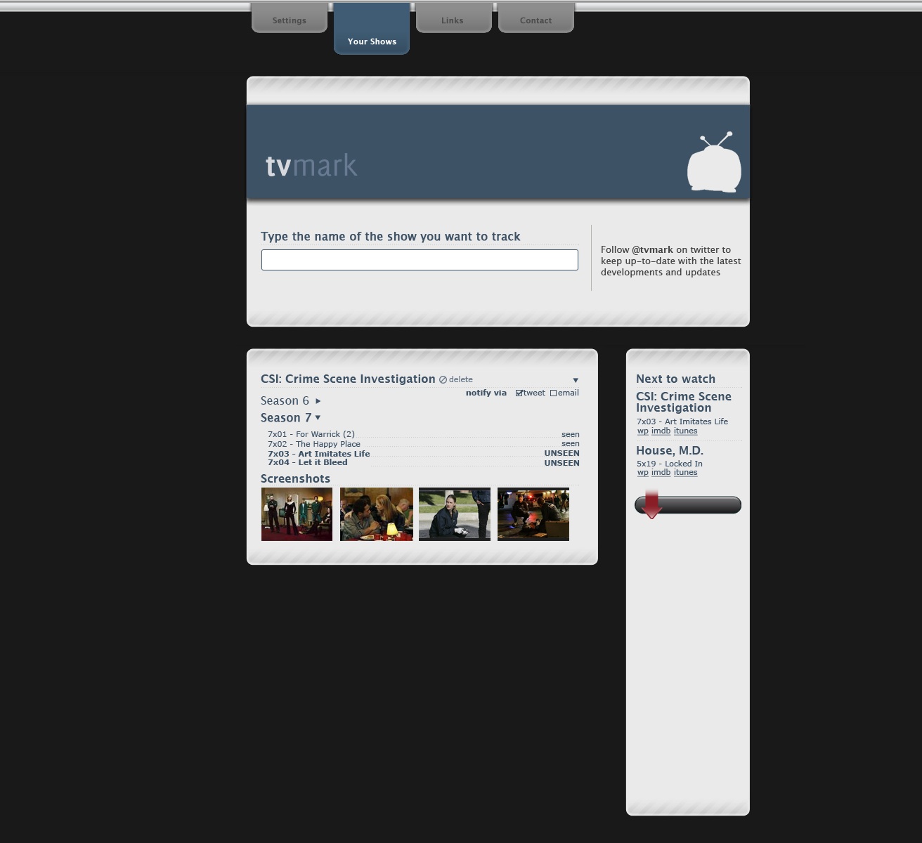
TV Mark
A site which track which episodes of TV shows you have watched. You create an account and enter the name of a TV show (AJAX completed, naturally). Before the show is associated with your account, you are shown a list of broadcast episodes and you must select the latest one you have watched. You can add as many shows as you like. When you visit the site, you see something like the visual here (although with the design not totally ripped from Automatic) so you can instantly tell what the next unseen episode is.
You can ask to be notified when a new episode is broadcast in a variety of ways (twitter, e-mail, rss). Shows can be broadcast anywhere in any country and so to get around the problem of detecting when a show is broadcast, the site actually follows a collection of well-known torrent providers. Note: this site doesn't provide any links to torrents or video files, it just relies on the fact that shows usually turn up on the torrent scene shortly after they have been broadcast. You can buy episodes or seasons from iTunes or Amazon links provided next to your tracking panel.
The visual isn't great as there will also be some big button on each show panel to increment the last show watched.
-
It's not difficult, don't make it difficult
What's easier? Boiling a single potato, letting it cool, mashing it using a toothpick then repeating with a different potato until you have a plateful of mashed potato...
or
Boiling all the potatoes you need at once then mashing them together with a potato masher?
Okay, choose between one of these methods of determining whether the bathroom light is on: Draw up a list of people who have visited your house recently. Interview them to build a data set of all rooms visited and by whom. Re-interview those who visited the bathroom. Determine a timeline of bathroom visits and light switch position on entry and on exit. Analyse the data to find the last visitor to the bathroom and the position of the light switch. Examine the electrical connections between the light switch and the light bulb to determine what the current status of the light itself might be.
or
Go look.
How are you doing on the quiz so far? Okay. So, final question: What's easier? Building a convoluted web site using proprietary code, conflicting CSS requiring you to target everything with !important, making all interaction rely on JavaScript for even the most basic functionality, fighting between form and function so much that you end up having a website that only works occasionally and even then only works for a subset of the available users.
or
Building a straightforward website using nothing but standard mark-up, styles which cascade in a predictable fashion and enhancing already-working functionality with a dash of JavaScript to make people go 'Ooh, shiny'?
If you thought the second option was easier, I'm sorry, you would appear to be wrong. At least, that's the impression I get every single day while wandering round the internet. It must be really easy to make a ham-fisted, in-bred, should be kept in the basement monstrous-crime-against-nature abomination of a website because otherwise, people wouldn't do it so much.
I've used Opera as my main browser for almost 10 years now and I've lost count of the number of times I've been faced with a message apologising to me because it appears my browser is out of date. If I could just update my browser to Internet Explorer 5, I could enjoy their site. Seriously, it must be a lot easier to make a web page locking me out of the site than not to. It must be a matter of a few seconds work to write browser-sniffing scripts and learn all the proprietary foibles of IE whereas not writing that script must take hours and not learning bad habits must take years.
I have some ability to forgive those websites which are obviously the work of someone whose passion is something else. If I'm looking at a site where a guy has meticulously documented the different ways different cats react to different balls of yarn, I'm guessing his interests is in yarn. Or cats. Or the combination thereof. He's not necessarily going to know the best way to make a website. I find it much harder, however, forgive big companies. Either those with an in-house web staff or those who contract agencies. Whatever way they do it, someone is getting paid to make the website. It is someone's job to write code.
I've always been of the opinion that if you're going to do any thing, you should at least try to do it as well as it can possibly be done. It doesn't matter if you're playing piano, rowing, juggling chickens or making a website, you have no excuse for not at least trying to be awesome at it. If you end up being awesome at it: great! You're the world's best chicken juggler, go into the world knowing that and be happy. If you don't: great! You gave it a darn good try and you probably ended up pretty good, at least. Maybe try juggling cats next time. I have a hard enough time getting my head around the idea that not everybody follows this same level of obsession in their interests but to have people who are actually getting paid actual money to do something (in this case, making a website, not chicken juggling) and who feel it's okay to be 'okay' is a concept I have great difficulty understanding.
Okay, impassioned rant over. I'm not going to name any sites. Just consider this a warning, Internet.
-
On holiday, by the way
In case any regular viewers are unaware, I'm currently on honeymoon. To tie in with this (and to celebrate the fact that my darling wife is almost as much of a geek as I am), there's a honeymoon blog to tide y'all over until I get back.
-
Ideas
To continue from the post of a month ago about how Noodle was awesome and ahead of its time, I now have to point out Sidewiki. Darn it, Google. Couldn't you just have bought me out? I'd have sold. Quite cheap, too...
Anyway. Onto the next idea. Or ideas.
Keen-eyed regulars (those whose don't subscribe via RSS, anyway) will have noticed the new category for 'ideas'. I may as well put all these dumb little ideas I have out there and see if anyone wants to have a go at playing with any of them. Actually, those who subscribe via RSS may have been inundated earlier with a bunch of ideas as I uploaded the backdated ones. Sorry 'bout that.
-
Okay, unnecesary redesign
Not two weeks after being pleased with myself that I could subtly rejig the design without only a few lines of CSS, I decided on Friday to completely redo this site.
Not only did I change the layout but I've made some major changes under the hood, too. I decided to have my first attempt at an HTML5 page. Granted, it might just fall apart at any moment in any given browser but...hey, it might not.
On the subject of HTML5, Mark Pilgrim (he of the 'Dive into...' series) brought up an interesting point in the WHATWG Blog last week on the topic of whether XHTML was actually a good idea in terms of enforcing XML syntax on an HTML document:
It provides no perceivable benefit to users. Draconianly handled content does not do more, does not download faster, and does not render faster than permissively handled content. Indeed, it is almost guaranteed to download slower, because it requires more bytes to express the same meaning -- in the form of end tags, self-closing tags, quoted attributes, and other markup which provides no end-user benefit but serves only to satisfy the artificial constraints of an intentionally restricted syntax.And, I guess, it is a good point that a well-formed XHTML document will be larger than the equivalently well-formed HTML document. If, however, developers are given a strict set of rules and a strict validator and told "make your page according to these rules, this alarm will go off if you've done it wrong", they're less likely to fall into bad habits than if they are told "These are mostly rules but sometimes suggestions, this alarm will only go off if you got things very very wrong". Mark Pilgrim is, quite rightly, focusing on the user's point of view but it just seems to me that users will also benefit from more maintainable, better structured code.
Of course, none of this actually matters yet and won't for the next five years or so. It probably won't matter then, either. It is only the interwebs, after all.
-
Multi-platform herding game.
You start off by choosing a type of animal to herd. These could be real animals or could be similar to real animals but more quirky (and therefore fun). You can start with 15 hens or 8 sheep or 6 pigs, etc. You then are given a top-down (or possibly zelda-style top down-ish) view of your herder and your animals.and you've just to get them from one side of a map to the other. All fine so far, yes? This is the gist of the single-player version. With each trip across the map, you get a gold coin which you can use to buy more animals or customise the ones you have (spray-paint the sheep, buy a new smock for your herder, etc).
The main bit of the game comes when you go online. Each install of the game has a unique map which is your own home field. When you go online, you can either invite people to come to your field or you can wander off to other people's fields and interact with them. An interesting bit of it is that you can leave your herder and herd to wander off themselves. If you're on a desktop, your herder wanders off whenever the screensaver comes on and you can choose to passively watch as it interacts with other herders on other machines, if you've got a mobile device, you can choose to send your little guy off when you close the game and the central server will track interactions while you're offline. When you start up again, you can choose to see where your herd went. There's also the possibility of having a flash piece which will just let viewers on the website passively watch.
I think it would also help if there was some system in place so that people's fields could be next to each other, you'd wander off the side of your field and into your neighbour's. If the neighbour stopped playing for a while, the next new player would move in. That way, you could zoom out and see the entire game world.
It's not as simple idea as my last game design (blob-pushing-around touch-screen, flash crossover thing) but that one has been done now (by someone else). I did actually make this game (above) about seven years ago and it was surprisingly fun but I didn't have the marketing budget to promote it (i.e. none). There are some interesting algorithms you can implement in order to get good herd behaviour. It doesn't need to be strictly accurate so you can get some cartoon-ish wandering-off, notice herd is far away, running after them behaviour.
-
Twampaign?
A v. simple 'put together a twitter campaign' site (twampaign.com or whatever). You sign up, choose a subdomain (e.g. http://ihateie6.twampaign.com/ ) and give it a list of hashtags, phrases, words and accounts it should keep track of. You then upload a header image, a couple of paragraphs of description, choose a colour scheme and advertise it.
New twitter campaign (or pretty monitoring software) in 2 minutes. Shazam.
-
Truly
I've just updated trulyinnovative.com and www.trulyinnovative.co.uk.
I randomly thought it was about time for a bit of a refresh but writing it, I was amazed at just how much has changed in the 3 years between the first and the second. Despite the fact that they're both supposed to be tongue-in-cheek, they are quite accurate descriptions of two different aspects of the people who 'do web'. Must remember to update them again in 2012.
-
Not-too-subtle subtle redesign
Okay, it's one of those occasions where I get to feel a bit smug. I decided to update the layout here a little bit, just make the content a bit wider, fonts a bit bigger, that kind of thing. Not a major restyling, just a quick once-round with the vacuum-cleaner, if you like. Less than a minute messing around with CSS later and it's done. It doesn't look like much but I was quite pleased that everything scaled nicely. It's still a bit scrappy round the edges and I wouldn't use this as a CSS showcase but I'm pleased never the less.
-
A new niche?
"And several months later, our intrepid hero returns to the village to find it full of people he doesn't know..."
A quick update. It's now over a year since Noodle launched and about 4 months since Wwwitter launched and I seem to have started a whole new niche of web-conversation sites. Most of them, I won't mention here but there are two notable examples: Convotrack and Tweetboard. If only I'd figured out a way to make money out of it before others did...oh well.
As I've said many times before, I need some kind of marketing genius to take all these little projects of mine and find out where the money-making potential is. I'll quite happily sit in my room repeatedly coming up with the Next Big Thing if someone will then go off and sell it. On a related note, if anyone fancies marketing MonkeyTV, let me know...
-
VoteSocial
VoteSocial
A 'create your own vote' social media site.
Users can create a subdomain of (for example) comptwitition.com and create their own user-votable competition. The emphasis will be on inter-city/international competitions (my city has better manhole covers than yours, for instance)
When creating a competition, admin makes a competition rules page (choosing from a preset list of rules) an about page (premise of competition), chooses whether the competition is geographical or not and defines the level at which geographical competitions takes place (intercity/international/city street/etc).
If it is a geocomp, any image uploaded must be placed on a google map (or if it has LatLong EXIF, use that) and will then have the category (side in the competition) suggested. This should be overwriteable if necessary.
Images can be uploaded either directly via the site, via an iPhone app, having a flickr URL entered or a twitpic url entered. Entries can also be emailed or tweeted @comptwitition.
Votes are done via a tweet entered on the site. The tweet would be @comptwitition and include the user's vote and a shorturl to the entry page.
-
The Digital Whateveritscalled
Recently, I've been trying to get to grips with this Brave New Digital Future that I've been hearing so much about. I figured that, seeing as I do this for a living, I should probably try and engage, interface, interact, give face time, connect and generally be a bit proactive about...oh, I don't know. Some buzzword or other.
That's why I joined Twitter and it has proven to be moderately useful in providing inspiration for the rebirth of Noodle. Wwwitter has had a few thousand unique visitors and several nice reviews (as an aside, I always find the best reviews have a sprinkling of exclamation marks and the worst have a smattering of question marks). The only real issue I have with Twitter is that in order to truly get Twitter, you need to follow the right number of people. Too few and it's like overhearing someone having a good conversation on the telephone – "Yeah, and that was only the first colour!" – too many and checking your feed is like sticking your head into a sugar-rushed playgroup – "I like ham!", "Ha-ha-ha!", "@everybody Look at me, look at me!"
This connected, emergent, digital whateveritis is also the reason I joined LinkedIn. I am, however, having a hard time trying to figure out what on earth it is. Is it "Your CV online"? I already have that. Is it "Facebook for business professionals"? Surely the business professionals who sign up to LinkedIn are already on Facebook so...why? I don't accept the argument that Facebook is for your fun side and LinkedIn is for your serious side. If it's online, it's out there in the public domain. If you are embarrassed by the possibility that someone from work might log into facebook and see "Jane Fakename joined the group 'LOL, I got drunk and dropped my mobile in the toilet'", the most obvious course of action is to not join that group, no?
I'm straying from my point, however. I had a look at LinkedIn. It keeps asking me for my goals, my objective, my "Specialties in Your Industries of Expertise". What is it asking? I always thought my goal was "Get old, fat and happy". The way I figure it, if I can do that, I've won whatever game the goal counts in.
Maybe it's just not aimed at people like me. Then again, I am a "Digital Media Professional" or at least, I play one on TV. I even have the word 'Manager' in my job title. I should be slap-bang in the middle of the target demographic, no?
Ugh. I need to become a pioneer in anti-social media.
-
Oh, hi again
And after a six-month hiatus, I'm back at the blog. Coincidentally, for the same six month period I stopped studying Japanese. Pretty much the day I got back from Tokyo, I put away my dictionary and didn't open it again until yesterday. Still, I'm back now and I'm starting private lessons again tonight so sit down and I'll make you a cuppa.
So, what's been keeping me away from the blogs and books for the last six months? Loads of stuff, to be honest. The new job for one: Digital Media Studio Manager for Whitespace. I wish I could say it's like herding monkeys just because I want to use the phrase "just like herding monkeys" but as it is, it's more like...managing a digital media studio. Or something like that. Outside work (but still within the geek realm), I've been working on Wwwitter, a cool little tool to show twitter discussions about a web page. Regular readers will of course recognise this as a direct copy of noodle but using someone else's content. It turns out that was all that was required to grab the attention of the internets.
The biggest thing to keep me busy, however, was getting engaged to my beautiful lady, Jenni and all the organising that entails. Well, all the organising Jenni's been doing and the confused nodding from me that entails. I'll try and post when I have more details but the big day is 12th September. Don't worry if you haven't received any kind of 'save the date' notification or anything, Jenni's sent hers out, I've just been a bit slow.