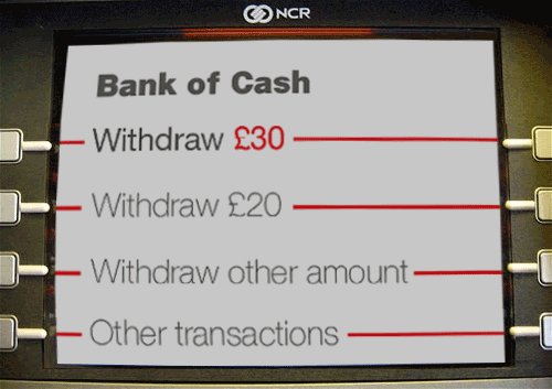
Cash machines, ATMs, AutoTellers, Cashpoints... whatever you call them in your bit of the world, have been around since the 1960s and yet there is still no user-interface standardisation. There’s a wide difference in user experiences, designs, hardware, layout. A certain amount can be attributed to the kind of variation you’d expect – font, colour, terminology – but after almost 50 years, there’s still a gulf between a good experience – the kind where you barely notice the machine: you have a task, you do it, you’re done – and a bad one – the kind that would prompt you to write a post about it, for example.
It may seem like a trivial thing to most people but I find I’ve actually started avoiding the machine near my house just because it is the worst offender I have ever come across in terms of consistency, design and sense. This interface was definitely planned by programmers and not designers.
Roughly, the process goes like this:
Screen one
Insert your card
Inserts card
Okay so far.
Screen two
Please type your PIN then press Enter
beep, beep, beep, beep[1], look for the Enter button...
Screen three
Please wait, processing...
Wait, I haven’t pressed enter yet! Apparently I didn’t need to press enter, did I? You were lying when you said ’press Enter’. You’re already making me dislike you.
Screen four
Would you like a receipt with this transaction?


                         yes >
                          no >
The gap between the question (at the top of the screen) and the options (at the bottom) is just big enough to make me want to double-check the question. This would be much better if the options were themselves descriptive:
       I want a receipt >
I do not want a receipt >
Even better if this was asked at the end of the transaction. Maybe I haven’t decided whether or not I want a receipt. I’ll have a better idea after my transaction. What if I say no now and change my mind later? Is it too late then? Will I get another chance? Oh no, I’m hyper-ventilating...
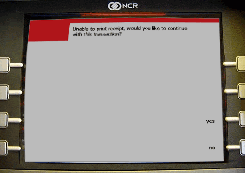
Related to this screen is my biggest cause for complaint. When there is no receipt paper left what does the machine do? Miss out this question? Replace it with a single notification screen? No, instead, we get this screen:
Screen four, take 2
Unable to print receipt, would you like to continue
with this transaction?


                         yes >
                          no >
If you’re in the habit of anticipating the receipt question, you’re prepped and ready to press ’no’ as in "No, I don’t want a receipt". However, if this screen comes up, even if you notice the question is different, nine times out of ten, muscle memory kicks in and you find yourself pressing it anyway with a voice in your head shouting ’Stooooop!’ at whatever’s controlling your finger. You press it, your card is spat out, you have to start again. This experience will ensure that the next time you’re presented with the screen, you’ll double-check the question then the options then the question and then the options. Twice. Even if you try to scan the text, your eyes will still pick out ’receipt’ in the middle and ’with this transaction’ at the end. That doesn’t help, you actually need to read and comprehend fully. And here was you thinking you only wanted to get some cash out.
Screen five
Please select transaction


                         View Balance >
                             Withdraw >
I don’t have too many complains about this screen except for the unnecessary distance between the question and the options. It is a touch irksome that they’ve now switched to action-based label text ("view") from the option-based labels ("yes" above)
Screen six
Please select amount to withdraw


        < £100                  Other >
        < £70	                   £50 >
        < £40	                   £30 >
        < £20	                   £10 >
I would like £30, please. *beep*
Screen seven
Please wait, processing...
About 30% of the time, this is the next screen:
Screen eight
Unable to dispense required amount. Please enter a
different amount.

   Suggested amount(s): £20, £40

   £[   ]
There are several annoyances with this screen:
- why was I even asked if I wanted £30 if the machine was never going to give me £30?
- what if I were to type in £50? Would the machine also be unable to dispense that amount? £20 and £40 are suggestions but there’s nothing to say why I can’t have £50.
- was it so utterly impossible for the programmers to figure out whether they were displaying one suggested amount or two? There should never be any reason for dynamically generated text to resort to the bracket(s).
The operators of these machines must have a lot of usage statistics so rather than give equal billing to all possible options throughout the process, why not reorganise so that the greatest number of people have the smallest amount of work to do? If 90% of users use the machines to withdraw £20, put that on the front screen (just after the PIN). Don’t insist on brand colours when they’re annoyingly intrusive on the user experience. Heck, why not just set the whole thing in off-black Helvetica on an off-white background with that ubiquitous swiss red colour?
I’d rather something like this

than something like this

Am I over-reacting?
Yes, completely. That’s not the point. Well thought-out user interfaces are what separates us from the animals. Or something like that. There are now over 2 million ATMs in the world, so unifying them will probably never happen but that doesn’t give the designers of the next generation of machines free reign to start from scratch all over again.
Am I generalising?
Okay, maybe a bit. Maybe a lot, actually. I’ve successfully used ATMs in a number of countries in a variety of languages but then, I do ‘tech stuff’ for a living. Without getting my hands on those usage statistics, I couldn’t really say.
Anyway, aren’t we supposed to be paying for everything by thumbprint these days?


