On recent web app projects in HERE Tracking, I've been using a layered component structure that fits particularly well with frontends that access and interact with JSON APIs.
The primary reason for structuring our apps this way is that it gives us a lot of freedom in our workflow and still fits well within the larger HERE structure with horizontal design teams that align across the multiple products. This works as a way to enable parallel contributions from everybody across the engineering teams.
The layers are:
- Application
- Library (JS library to access the API)
- Logical (maps business objects to layout concepts)
- Layout (renders layout components)
- Components (low level elements and design)
And, generally, these layers are within the areas of expertise of the Backend, Frontend and Design specialists.
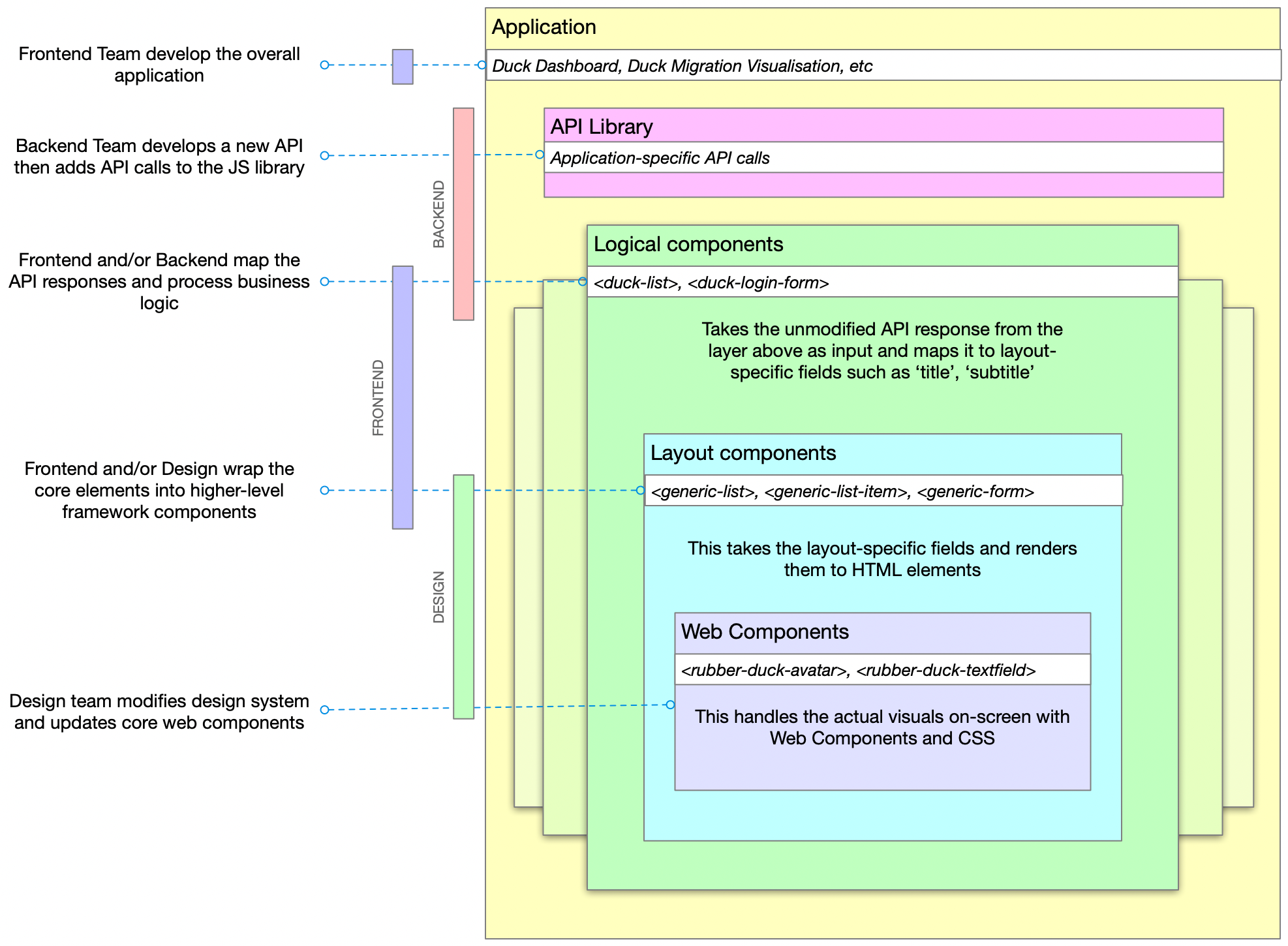
It shouldn't be necessary to say this but just to make sure I'm not misunderstood: it's important to note that none of these roles is limited to the scope below, this is just a general 'areas of expertise' guide. See my previous post about shared responsibilities.
- Backend teams create the API and implement the JS library. If possible, also implement the basic logical component which performs whatever business logic is required.
- Frontend teams build the application out of components, further maintain the logical components and the mapping between logical and layout components
- Design teams implement the core web components and company-wide design system of UX, UI, mental models, etc. This layer can also be based upon an open-source design system such as Carbon or Material.
Of course, the backend team can modify the web components if they have the inclination just as the design team couuld make improvements to the database if they are able to improve the product.
Example
NOTE: The example below is mostly Vue-like but this layered approach doesn't rely on any framework, language or coding style. It's a way to split and share responsibilities.
Rubber Duck Inc. make GPS-enabled rubber ducks. They have a dashboard where customers can see the location of their ducks. The dashboard includes an overview list of ducks.
Backend
The Backend team extend the Duck definition (stored in their duck-ument database) to include a new 'icon' field then update the GET /ducks endpoint that allows you to receive a list of all the ducks you own.
Sample response:
{
  "data": [{
    "id": 123,
    "name": "Hugh",
    "colour": "hotpink,
    "icon": "star",
  }, [{
    "id": 321,
    "name": "Anthony",
    "colour": "yellow",
    "icon": "dot",
  }],
  "count": 2
}
They check to see if the JS library needs updating (if they are using automated code generation, this might already be done). It doesn't, it already returns the full data array of the response:
fetch(`${api}/ducks`)
  .then(response => response.json)
  .then(json => json.data)
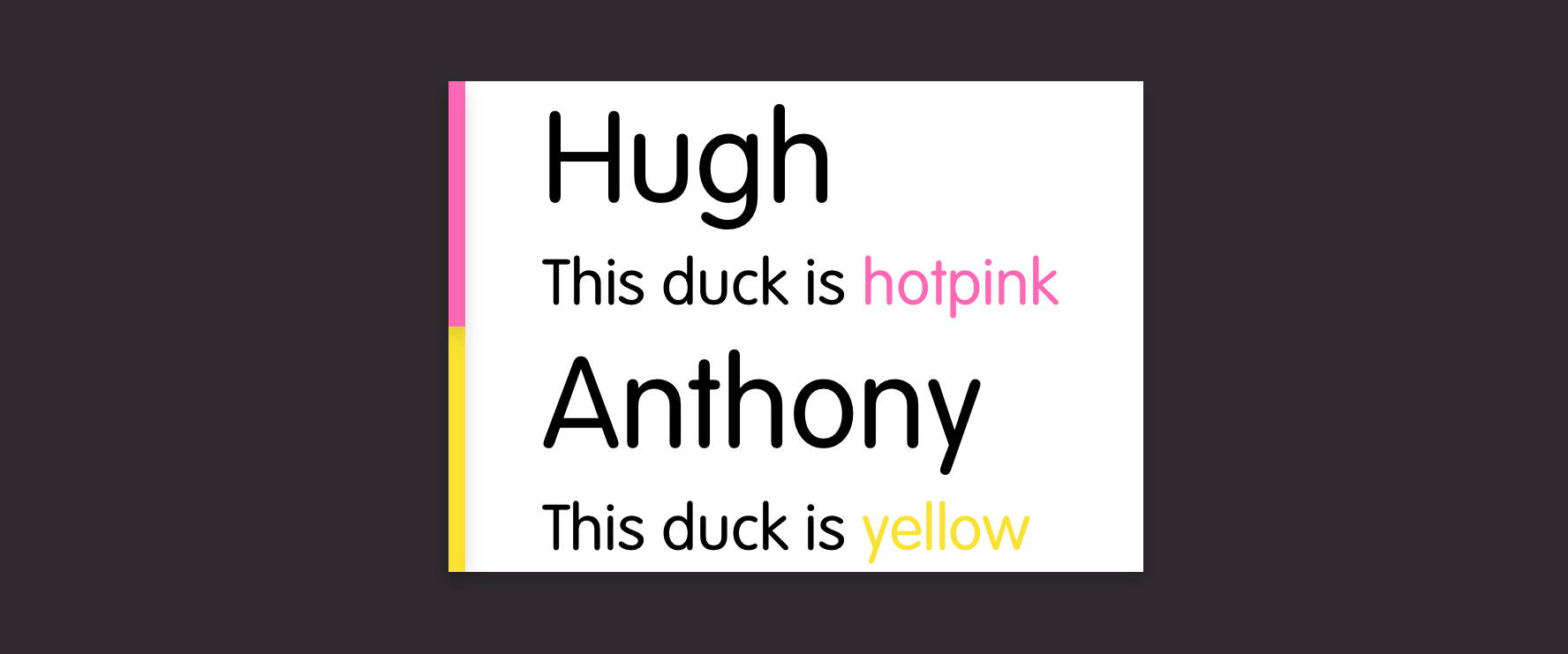
The data is rendered in the web app using a logical web component
<duck-list :ducks="ducks"/>The engineer digs one step deeper (into the 'logical' or 'application components' library) and sees that the duck-list component wraps the generic-list component but with a few modifications to the data structure.
<template>
  <generic-list :items="items"/>
</template>
<script>
  :
  props: {
    ducks: Array,
  },
  data() {
    return {
      items: this.ducks.map(duck => ({
        title: duck.name,
        subtitle: `This duck is ${duck.colour}`,
      }))
    };
  },
  :
</script>
And then modifies it to also pass the icon into the generic-list so that each item looks like:
{
  title: duck.name,
  subtitle: `This duck is ${duck.colour}`,
  icon: duck.icon
}
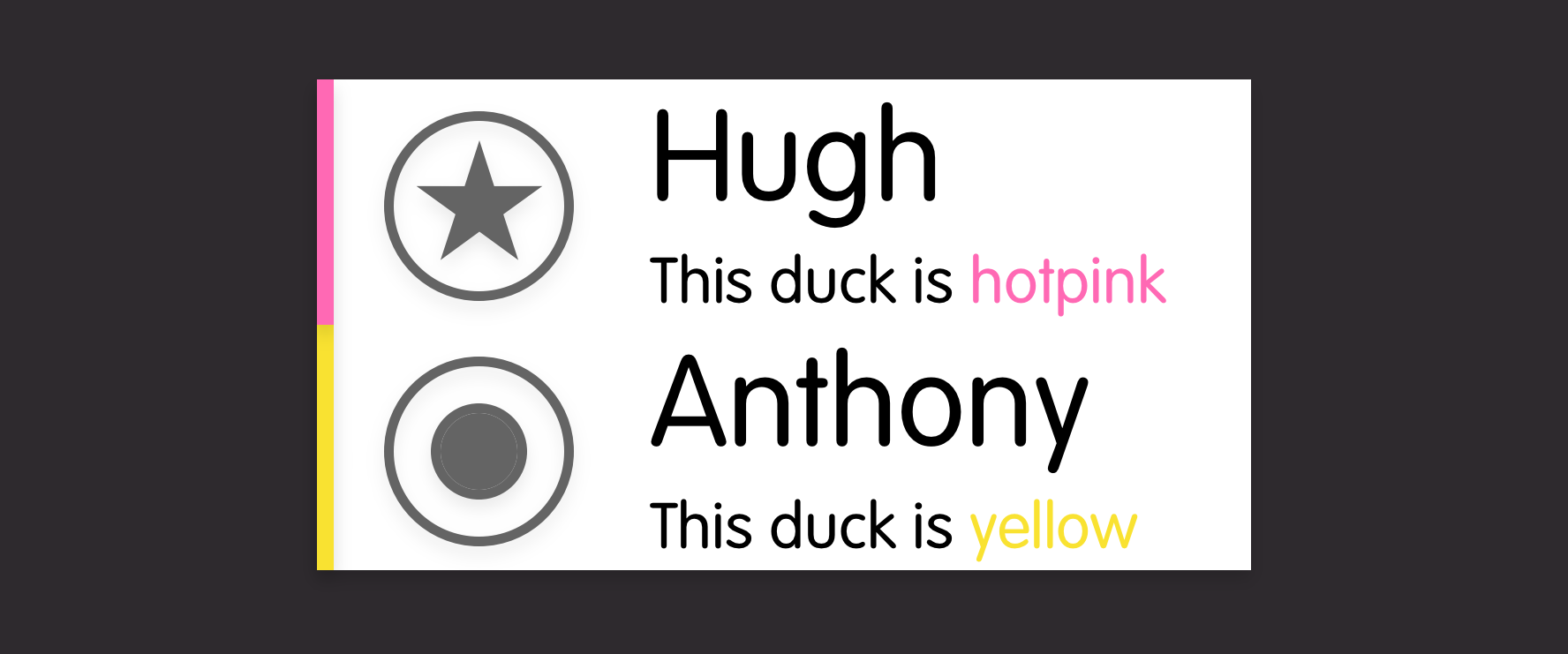
Frontend
In a parallel task, the frontend specialist can be improving the generic-list component. This component doesn't do much except create a set of generic-list-item elements.
<template>
  <ul>
    <generic-list-item for="item in items" :item="item">
  </ul>
</template>
Each generic-list-item is built from basic web components from the company's DuckDesign language:
<template>
  <li>
    <rubber-duck-title>{{title}}</rubber-duck-title>
    <rubber-duck-subtitle>{{subtitle}}</rubber-duck-subtitle>
  </li>
</template>
Frontend can then improve this to take advantage of the new data structure. Handily, there's a rubber-duck-avatar component. That should work here:
<template>
  <li>
    <rubber-duck-avatar if="icon">{{icon}}</rubber-duck-icon>
    <rubber-duck-title>{{title}}</rubber-duck-title>
    <rubber-duck-subtitle>{{subtitle}}</rubber-duck-subtitle>
  </li>
</template>
Design
So close, except the alignment's not quite right... Frontend has a chat with design and they decide that, while this could be solved in the generic-list-item component (or even in the duck-list or the application layer), having an icon next to a title is a more generic requirement so it should be solved in the lowest design component layer:
rubber-duck-avatar + rubber-duck-title {
  margin-left: 0;
}
Design tweaks the alignment of the rubber-duck-avatar component and deploys it company-wide to all product teams. Every team benefits from the shared library, the DuckDashboard team gets to show off their new duck icons, everybody helped complete the product story and nobody got hurt.
Conclusion
Admittedly, this does lead to having multiple individual repositories for a single application
- dashboard-app
- duck-api.js
- dashboard-components
- layout-components
- duck-design-web-components
But it does give each team the flexibility to contribute beyond their core area and not be blocked by other teams.
Let me know what you think or how you'd improve it. Do you already use an approach like this?