The views and opinions expressed within are not those of National Museums Scotland. This site is in no way affiliated with National Museums Scotland or the website www.nms.ac.uk
First of all, the disclaimer: I am not a designer. If I were to make claim to being anything creative it's an illustrator but there's a huge difference between the two (I've always said that an illustrator makes the thing to go on the t-shirt, the designer says where on the t-shirt it goes). Despite the recent trend for everyone to call themselves web designers, I'm still going to go by web developer. I make things.
Bearing that in mind, there are still quite a few web design and UX tips and techniques I've picked up along the way which can be applied to most sites and not interfere with the mysterious ways of designers.
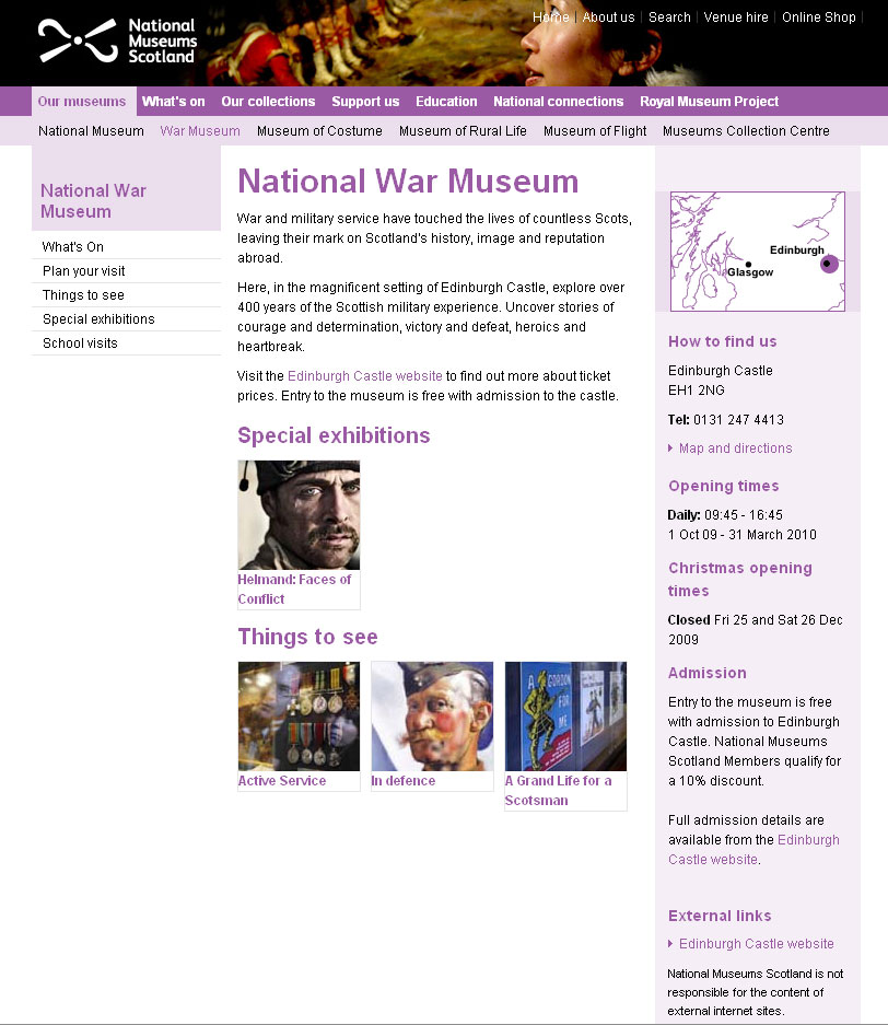
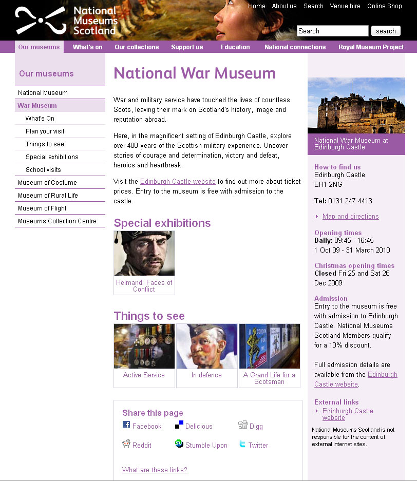
Recently, I've been reworking templates for National Museums Scotland for faster load times and better SEO and I'll illustrate what I'm talking about with a couple of examples from there. The brief on these templates is that the content can't really change and there are some chunks that the CMS generates which can't be changed. Note: the NMS templates are completely finished yet and those that are haven't been rolled out across the whole site but sticking with that whole release early, release often way of doing things, these little incremental improvements can be applied without affecting too much else.
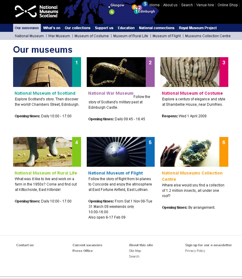
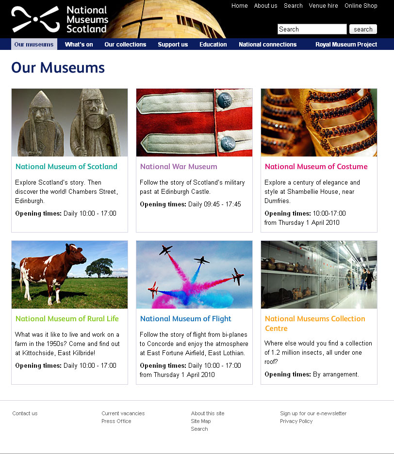
For reference, here are before and after screen grabs of two of the templates.
Some people will find these tips blatantly obvious but the fact that pages still get made without considering these means they do need reiterating.
Link the Logo
The web's been around for a few years now and there are a few conventions users have gotten used to. One of them is that the logo is a link that takes you back to the home page. It doesn't harm anything to have a link there so even if 99% of visitors don't use it, why annoy the 1% who do?
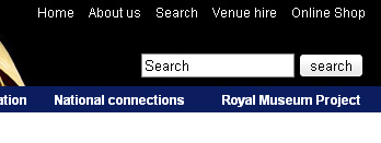
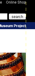
Don't link to the search
From the moment the visitor decides they want to search your site for something, the most important thing is to get the results in front of them as quickly as possible. It therefore makes for a better experience if you bring the results one step closer to them. Rather than requiring the user to click on a link to get to the search form to do their search to get the results, put the search box on every page. They fill it in and go to the results page. If the user wants to take advantage of any advanced search features you may have, they can modify their search from the results page.
Line up
I'm sure there's more to design than this but there are a couple of well tested rules I recommend any non-designer to learn:
- If it doesn't line up, make it line up.
- If it's already lined up, make it not.
That and a subscription to iStock and you're done...
Make the hit area as big as possible
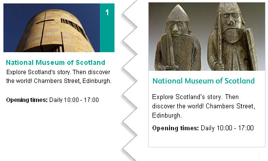
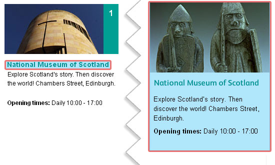
From the gateway page for Our Museums, there are two ways the user could go. They were either looking for opening times (in which case, they're done), or they want to find out more information about the individual museums on their own pages. To that end, it makes sense to make the next step as easy as possible and bascially turn the content this page into six huge buttons. To keep everything semantic, JavaScript has been used here to extract the destinations from each of the links and apply them to the whole panel area (it'll default to linked text and image with JavaScript disabled). As you can see, doing this changes the hit area for each museum from a line of text to a veritable barn door.
White text on a white background is not good
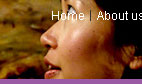
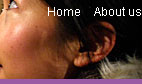
Actually, I'm not sure whether it's the fact that the link wasn't as readable as it could have been or the fact that to go home requires poking her in the eye that upset me most. Either way, if you do need to use an image that has a light bit underneath some light text and you can't shuffle it along like here, a quick wipe with the burn tool in Photoshop works wonders.
Underline links
I'm not going to get into the debate over whether or not designers hate underlines but for a high-traffic, public sector with an extremely varied demographic, I'd recommend using them. As Paul Boag mentions, what you do with your design and your solutions for various usability issues depends on the audience. A graphic designer's portfolio might very well eschew underlines when denoting links, a government site probably shouldn't. Especially when you remember that you should never rely on colour alone to convey information, including whether not a piece of text is a link.
Titles are titles of something
If you have a title, it generally refers to the thing below it, not the thing above it. Make sure you keep titles and the things they are titles of together.
Avoid disparate navigation
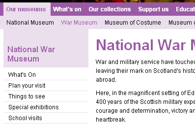
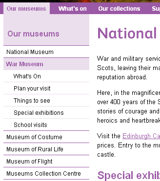
Again, another of the rules of web that has evolved over the last several years: Sections go along the top, navigation down the side. To keep consistent with the rest of the site the horizontal museum links were brought down and integrated with the rest of the navigation. This maybe isn't the most illustrative example but, basically, don't have a top nav, left nav, right nav and several others when you could have just one.
Only a fraction
There we are, a few handy little tips for your next build project. This hasn't gone into any issues of column width, line-height - or leading (pronounced /ˈlɛdɪŋ/) as designers call it, hover states or any of the myriad other things it could, just a few of the more important and easy-to-do ones.