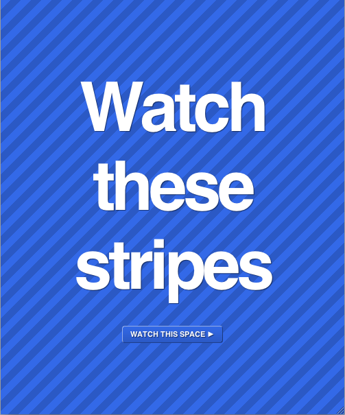
You may have seen Google's 'Watch this space' advertising appearing all over the place. They have quite eye-catching diagonally striped backgrounds in various colours. A couple of days ago, I was wondering how easy it would be to recreate this in CSS without images. Unfortunately, the state of CSS 3 is such that some things work wonderfully, some just plain don't (scoped attribute, I'm looking at you). The following code relies on vendor extensions and so, unless you're willing to tend it and correct it after the spec is finalised, don't use this on a production server.
The most obvious thing to notice from the following code, though, is the competing syntax for the repeating linear gradient style. Mozilla have separated it into a distinct style (-moz-repeating-linear-gradient) while Webkit have built it as an option to their general gradient style (-webkit-gradient).
body {
	background-image: -moz-repeating-linear-gradient(
		-45deg,
		transparent,
		transparent       25%,
		rgba(0,0,0,0.15)  25%,
		rgba(0,0,0,0.15)  50%,
		transparent       50%,
		transparent       75%,
		rgba(0,0,0,0.15)  75%,
		rgba(0,0,0,0.15)
	);
	background-image: -webkit-gradient(
		linear,
		0% 0%,
		100% 100%,
		from(transparent),
		color-stop(0.25, transparent),
		color-stop(0.25, rgba(0,0,0,0.15)),
		color-stop(0.50, rgba(0,0,0,0.15)),
		color-stop(0.50, transparent),
		color-stop(0.75, transparent),
		color-stop(0.75, rgba(0,0,0,0.15)),
		to(rgba(0,0,0,0.15))
	);
}
To get a better idea of what this does, view source on this demo page. This includes a button to change the class on the body (using JS) which simply changes the background colour – the stripes are semi-transparent on top of that. Remember, due to the vendor prefixes, this only works in -moz or -webkit browsers.
It's supposed to look like this: