So, I couldn't help myself. I had a niggling idea at the back of my head that I needed to get out. After coming up with this Twitter weather idea last week, I decided to spend a couple of hours this weekend building it. As if I didn't have other things I should have been doing instead...
It works pretty much exactly how the pseudocode I mentioned last time describes. Every few minutes, a script will search Twitter for mentions of any weather words from several different languages. It will then look up the location of the person who tweeted that and store it. Single reports might be wrong and users might not have stored their actual location but over a large enough sample, this system becomes more accurate. The script removes any matching twets older than 6 hours.
To display, I actually ended up using Geohashes instead of Geotudes because it is easier to simplify them when you zoom out just by cutting off the tail of the hash. For example, the physical area denoted by gcvwr3qvmh8vn (the geohash for Edinburgh) is contained within gcvwr3 which is itself contained within gcv. There are a few technical problems with geohashes but it seems the best fit for this purpose. If anyone knows of any better suggestion, please let me know. I do realise that this is quite possibly the slowest, most inefficient JavaScript I've ever written because it makes an AJAX call for every graticule and it probably should just send the South-East and North-West bounds and get back an array of them but, like I said, there were other things I should have been doing. Because the overlaid grid changes resolution based on zoom level, there are a few places where it is either tragically slow (resolution too fine) or terribly inaccurate (resolution too rough). That's just a case of tweaking the algorithm. Similarly, it's set to display reports of weather if there are 2 or more matches but it could be tweaked to only show if a larger number have reported something.
So go, play with the Twitter-generated weather map. If someone can come up with a good, catchy name, or some better graphics, that'd be great, thanks.
This is a more general version of the #uksnow map idea. It's a crowd-sourced weather map which relies on the fact that any one individual tweet about the weather might be inaccurate but given a large enough sample, enough people will mention the weather in their area to make this a workable idea. It doesn't require people to tweet in a particular format.
To get info
Have an array of weather words in various languages (rain, hail, snow, schnee, ame, yuki)
every 5 minutes:
	foreach weatherword
		search twitter for that word
			http://search.twitter.com/search.atom?q=rain
		retrieve latest 100 tweets
		foreach
			get user info
				http://twitter.com/users/show.xml?screen_name=username
			get user.location if available
			geocode
			save:
				username, time, lat, long, geotude, weatherword
		Remove any tweets about this weatherword older than 6 hours.
To display info
Show a Google map
Based on current Zoom level, split the current map into about 100 geotudes
foreach geotude
	search database for any weather results for that block (probably using an ilike "1234%" on the geotude field)
	sort by weatherword count descending
	draw an icon on top of that block to show the most common weatherword

If the user zooms in, recalculate geotudes and repeat.
I quite like that this uses geotudes which I think are an excellent idea.
After reading Aza Raskin's post about Firefox moving its tabs down the side of the window, I decided to give it a go in Opera. It turns out to be very useful when you have a widescreen monitor. I usually end up with several dozen tabs open at once and it's much easier to be able to put them down the side in an area which is, for most websites at least, dead space. On the rare occasions I do find myself on a website which requires more than the 1470px horizontal space this gives me, I can just tap f4 and get my full 1650px back. As the window sidepanel also groups by window and lists all tabs open across all windows, I can keep them ordered thematically, too.
This arrangement definitely doesn't work, however, when you have a small screen. When I tried this on my netbook, I had to choose between losing half of my screen to the tab list or only being able to read the beginning of each page title, even if I only had one tab open.
The views and opinions expressed within are not those of National Museums Scotland. This site is in no way affiliated with National Museums Scotland or the website www.nms.ac.uk
First of all, the disclaimer: I am not a designer. If I were to make claim to being anything creative it's an illustrator but there's a huge difference between the two (I've always said that an illustrator makes the thing to go on the t-shirt, the designer says where on the t-shirt it goes). Despite the recent trend for everyone to call themselves web designers, I'm still going to go by web developer. I make things.
Bearing that in mind, there are still quite a few web design and UX tips and techniques I've picked up along the way which can be applied to most sites and not interfere with the mysterious ways of designers.
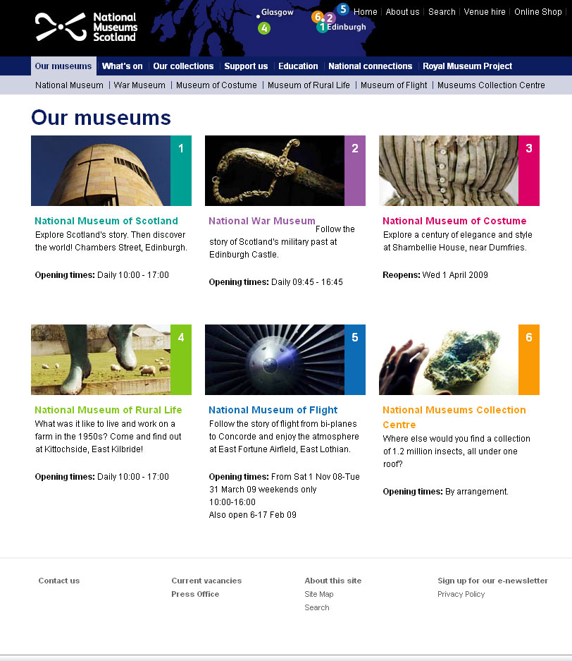
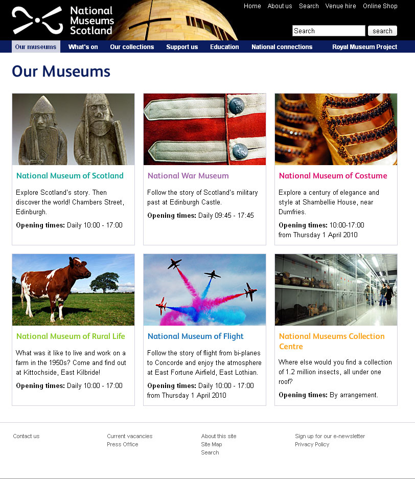
Recently, I've been reworking templates for National Museums Scotland for faster load times and better SEO and I'll illustrate what I'm talking about with a couple of examples from there. The brief on these templates is that the content can't really change and there are some chunks that the CMS generates which can't be changed. Note: the NMS templates are completely finished yet and those that are haven't been rolled out across the whole site but sticking with that whole release early, release often way of doing things, these little incremental improvements can be applied without affecting too much else.
For reference, here are before and after screen grabs of two of the templates.
Some people will find these tips blatantly obvious but the fact that pages still get made without considering these means they do need reiterating.
Link the Logo
The web's been around for a few years now and there are a few conventions users have gotten used to. One of them is that the logo is a link that takes you back to the home page. It doesn't harm anything to have a link there so even if 99% of visitors don't use it, why annoy the 1% who do?
Don't link to the search
From the moment the visitor decides they want to search your site for something, the most important thing is to get the results in front of them as quickly as possible. It therefore makes for a better experience if you bring the results one step closer to them. Rather than requiring the user to click on a link to get to the search form to do their search to get the results, put the search box on every page. They fill it in and go to the results page. If the user wants to take advantage of any advanced search features you may have, they can modify their search from the results page.
Line up
I'm sure there's more to design than this but there are a couple of well tested rules I recommend any non-designer to learn:
If it doesn't line up, make it line up.
If it's already lined up, make it not.
That and a subscription to iStock and you're done...
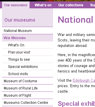
Make the hit area as big as possible
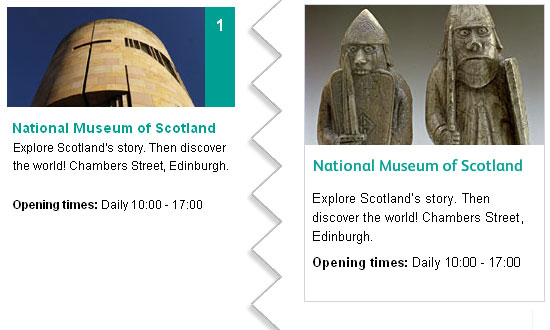
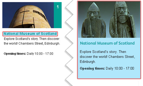
From the gateway page for Our Museums, there are two ways the user could go. They were either looking for opening times (in which case, they're done), or they want to find out more information about the individual museums on their own pages. To that end, it makes sense to make the next step as easy as possible and bascially turn the content this page into six huge buttons. To keep everything semantic, JavaScript has been used here to extract the destinations from each of the links and apply them to the whole panel area (it'll default to linked text and image with JavaScript disabled). As you can see, doing this changes the hit area for each museum from a line of text to a veritable barn door.
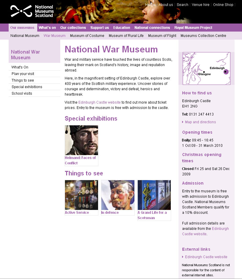
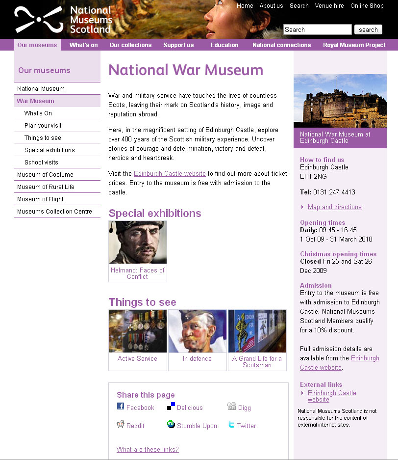
White text on a white background is not good
Actually, I'm not sure whether it's the fact that the link wasn't as readable as it could have been or the fact that to go home requires poking her in the eye that upset me most. Either way, if you do need to use an image that has a light bit underneath some light text and you can't shuffle it along like here, a quick wipe with the burn tool in Photoshop works wonders.
Underline links
I'm not going to get into the debate over whether or not designers hate underlines but for a high-traffic, public sector with an extremely varied demographic, I'd recommend using them. As Paul Boag mentions, what you do with your design and your solutions for various usability issues depends on the audience. A graphic designer's portfolio might very well eschew underlines when denoting links, a government site probably shouldn't. Especially when you remember that you should never rely on colour alone to convey information, including whether not a piece of text is a link.
Titles are titles of something
If you have a title, it generally refers to the thing below it, not the thing above it. Make sure you keep titles and the things they are titles of together.
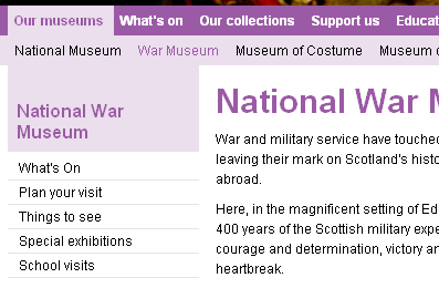
Avoid disparate navigation
Again, another of the rules of web that has evolved over the last several years: Sections go along the top, navigation down the side. To keep consistent with the rest of the site the horizontal museum links were brought down and integrated with the rest of the navigation. This maybe isn't the most illustrative example but, basically, don't have a top nav, left nav, right nav and several others when you could have just one.
Only a fraction
There we are, a few handy little tips for your next build project. This hasn't gone into any issues of column width, line-height - or leading (pronounced /ˈlɛdɪŋ/) as designers call it, hover states or any of the myriad other things it could, just a few of the more important and easy-to-do ones.