Plan
A very simple web app that generates a music visualisation from an audio file and renders it to a downloadable movie file. Most importantly, it does this all on the client side.
To do this, we'll combine the Web Audio API, Canvas API and MediaStream Recording API. I'll not be providing the complete source code as we go through it but just enough to point you in the right direction.
For more detail, I recommend the following:
I've used this as the basis to create all the music videos for my next album. You can see examples in my previous post.
TL;DR
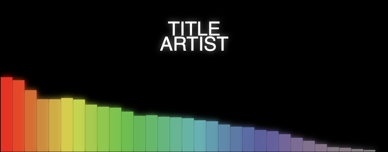
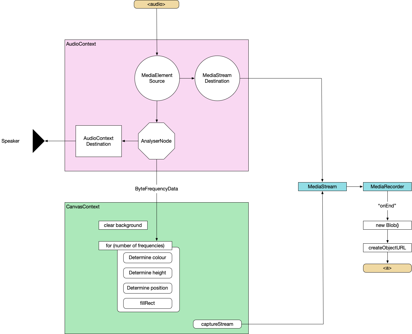
Here's the complete architecture of what we're building:
And here's the finished build: All-In-One Music Visualiser
Basic HTML
First, let's just set up some basic HTML to show the visualisation, hold the audio and take in some parameters.
<canvas></canvas>
<audio controls></audio>

<label>Track title:
  <input type="text" id="track" placeholder="Track title">
</label>
<label>Artist name:
  <input type="text" id="artist" placeholder="Artist name">
</label>
<label>Audio File:
  <input type="file" id="file" accept="audio/*" />
</label>
Read in audio file
const audio = document.querySelector('audio');
audio.src = URL.createObjectURL(document.querySelector('[type=file]').files[0]);
audio.load();
Web Audio API
Wire up Web Audio
Create an AudioContext, source the audio from the <audio> element, prepare a streaming destination for later and connect the in to the out.
const context = new AudioContext();
const src = context.createMediaElementSource(audio);
const dest = context.createMediaStreamDestination();
src.connect(dest);
Attach an analyser node
We want our visualisation to react to the music so we need to wire in an AnalyserNode. Thankfully, this handles all the complicated audio processing so we don't need to worry about it too much. We also attach the analyser to the destination node of the AudioContext so that we can hear it through the computer speakers. Not strictly necessary but it's nice to be able to hear what we're doing.
const analyser = context.createAnalyser();
src.connect(analyser);
analyser.connect(context.destination);
Prepare to sample frequency
the fftSize is essentially "How detailed do we want the analysis to be?". It's more complicated than that but this is all the detail we need for now. Here, we're using 64 which is very low but 512, 1024 and 2048 are all good. It depends on the actual visualisations you want to produce at the other end.
The smoothingTimeConstant is approximately "How much do we want each sample frame to be like the previous one?". Too low and the visualisation is very jerky, too high and it barely changes.
analyser.fftSize = 64;
analyser.smoothingTimeConstant = 0.8;

const bufferLength = analyser.frequencyBinCount;

// Prepare the array to hold the analysed frequencies
const frequency = new Uint8Array(bufferLength);
Finally grab the values from the <input> elements.
const titleText = document.querySelector("#track").value.toUpperCase();
const artistText = document.querySelector("#artist").value.toUpperCase();
Canvas API
Now we do the standard canvas setup – grab a reference to the canvas, set our render size (doesn't need to be the same as the visible size of the canvas) and prepare a 2d context.
Prepare Canvas
const canvas = document.getElementById("canvas");
canvas.width = 1280;
canvas.height = 720;
const ctx = canvas.getContext("2d");
Render loop
Execute this on every render frame.
function renderFrame() {
  // schedule the next render
  requestAnimationFrame(renderFrame);

  // Grab the frequency analysis of the current frame
  analyser.getByteFrequencyData(frequency);

  // Draw the various elements of the visualisation
  // This bit is easy to modify into a plugin structure.
  drawBackground(ctx);
  drawBars(ctx, frequency);
  drawText(ctx, titleText, artistText);
}
The various visualisation elements:
function drawBackground(ctx) {
  ctx.fillStyle = 'white';
  ctx.fillRect(0, 0, canvas.width, canvas.height);
}
function drawBars(ctx, frequency) {
const widthOfEachBar = (canvas.width / frequency.length);
// Loop over data array
for (let i = 0; i < frequency.length; i++) {
const heightOfThisBar = frequency[i];
// Base the colour of the bar on its index
const h = 360 * index;
// Base the saturation on its height
const s = 100 * (heightOfThisBar/256);
const l = 50;
const color = `hsl(${h}, ${s}%, ${l}%)`;
ctx.fillStyle = color;
// Add a little shadow/glow around each bar
ctx.shadowBlur = 20;
ctx.shadowColor = color;
// Draw the individual bar
ctx.fillRect(x, canvas.height - heightOfThisBar, widthOfEachBar - 1, heightOfThisBar);
x += (widthOfEachBar);
}
}function drawText(ctx, titleText, artistText) {
ctx.fillStyle = 'white';
ctx.textAlign = 'center';
ctx.font = '4em sans-serif';
ctx.fillText(titleText, canvas.width/2, canvas.height/2 - 25);
ctx.fillText(artistText, canvas.width/2, canvas.height/2 + 25);
}By this point, we can load a supported audio file and see some pretty pictures reacting to the music.
MediaRecorder
This section is copied almost word-for-word from StackOverflow
First, we'll create a combined MediaStream object from the audio data and the canvas data.
const chunks = []; // here we will store our recorded media chunks (Blobs)
const stream = canvas.captureStream(); // grab our canvas MediaStream

let combined = new MediaStream([
...stream.getTracks(),
...dest.stream.getTracks(),
]);
Next, we start recording that data chunk-by-chunk. We'll save it as webm.
const rec = new MediaRecorder(combined, {
  audioBitsPerSecond : 128000,
  videoBitsPerSecond : 2500000,
  mimeType : 'video/webm'
});
When the recorder receives a chunk of data, store it in memory.
rec.ondataavailable = (e) => chunks.push(e.data);When we finish recording, combine the chunks and send them to an export method
rec.onstop = (e) => exportVid(new Blob(chunks, { type: "video/webm" }));
rec.start();
This is sometime necessary to avoid async timing issues when loading the audio data. It doesn't hurt, at least.
audio.addEventListener("durationchange", () => {
  setTimeout(() => rec.stop(), Math.floor(audio.duration * 1000));
}
The final video export. We convert the combined chunks (the Blob) into an object URL and create an anchor that lets us download it from the browser.
function exportVid(blob) {
  const a = document.createElement("a");
  a.download = "myvid.webm";
  a.href = URL.createObjectURL(blob);
  a.textContent = "download";
  document.body.appendChild(a);
}
This export call will be triggered after the audio has finished. You load an audio file, watch the visualisation play through, when it's finished, you click the download link and you get a webm.
So now, we have the basis for a complete music video generator – audio in, video file out.
Try the basic version out – All-In-One Music Visualiser.
Or watch a video generated using this basic version (as a bonus, this music was also automatically generated in the browser but that's a topic for another day):
Don't forget, you can also find me on Spotify.