When messing about with another little game idea, I found myself retyping (for the umpteenth time) the same little bit of value bounding code I use a lot:
var x = Math.max(0, Math.min(y, 1))
Which basically translates to:
"Set x to be the value of y as long as it's between 0 and 1.
If not, set it to
  0 if it's smaller or
  1 if it's larger."
Of course, 0 and 1 don't need to be the boundaries, I'm just using them for convenience.
Instead of continuing with the game, I decided to take a little tangent and see if there was any way I could rewrite this so that the syntax was a bit more obvious. I'd like to be able to use syntax like:
x = [0 < y < 1]
to mean the same. Written exactly as above, JS will try and evaluate left-to-right, changing the comparisons to booleans. The statement would become
y = 0.5

x = [0 < y < 1]
x = [0 < 0.5 < 1]
x = [true < 1]
x = [false]
Similarly:
y = -0.5

x = [0 < y < 1]
x = [0 < -0.5 < 1]
x = [false < 1]
x = [true]
My first thought was to be clever about it, I wanted to try and figure out how to partially evaluate the expression and take the different outcomes to figure out the logic required. If '0 < y' was false, then y is less than zero therefore outside our bounds, the return value should then be 0. If the first part is true and the second is false then we know the value is higher than our bounds....etc and so on.
This proved to be a logical dead-end as there was no good way to partially evaluate the statements. Not without preparsing the JS, anyway. Which leads me onto the second attempt...
Preparsing the JS
The next attack on the problem was the idea of reading the JS as a string, shuffling it around quickly and silently (not like a ninja, more like a speedy librarian in slippers) and put it back where it was.
So I began to look at ways to recreate that. I remembered from many, many years ago (two, actually) Alex Sexton creating the genius abomination that is goto.js and how that used some kind of preparsing. A quick skim through the code later and I ended up on James Padolsey's site looking at parseScripts.js.
In the end, all I needed to do was include parseScripts (which is a generalised form of the code I ended up using for the whitehat SEO question from last month) and provide a new parser function and script type.
I'm not saying parseScript isn't clever because it most definitely is but I am saying it's simple. There's not always a need to branch off into deep technical investigations of partial evaluation when a simple search-and-replace does the job better and faster.
For someone always going on about bringing simplicity and pragmatism into development, you'd think I'd have gotten there faster...
cssert – pronounced however you feel like it – is my attempt at bringing some kind of style verification into an automated build process. If you've read the previous article, you'll know that this falls into the second group of CSS test frameworks, style measurement and comparison. The system works exactly as I described above – your test files have a basic HTML structure created by traversing the DOM from the element being tested upwards. You could also include your entire HTML in the test file if you liked, it would just be unnecessary in most cases.
I've created a couple of (for me, at least) helpful utilities which allow these test cases to be generated from a page via a bookmarklet and then run in the browser or on the command-line. Running the tests in the browser is useful for quick human verification while the command-line interface can be integrated into an automated build system if you like that kind of thing. The test file structure is quite simple (all samples here taken from the Twitter Bootstrap project:
First, we have the test file opening structure:
<!doctype html><html><head><title>cssert test page</title><link rel="stylesheet" href="../lib/cssert.css"></head><body><h1>cssert Test cases</h1><p>click to expand test</p><script type="text/html">/*==
Then we have the name of the test:
Intro Paragraph
Then we have the skeleton DOM:
<!doctype html><html><head><meta charset="utf-8"><base href="http://twitter.github.com/bootstrap/examples/hero.html"><link href="../1.3.0/bootstrap.css" rel="stylesheet"><style type="text/css">
      body {
        padding-top: 60px;
      }
    </style><style>#cssert-style-modal {display:none;position: fixed;top: 10%;left: 50%;margin-left: -350px;width: 700px;background: #39c;color: white;padding: 10px;color: #fff;text-shadow: 0 1px 0 rgba(0,0,0,.3);background-image: -webkit-linear-gradient(-45deg, rgba(255,255,255,0), rgba(255,255,255,.1) 60%, rgba(255,255,255,0) 60%);border-radius: 5px;border: 1px solid #17a;box-shadow: inset 0 0 0 1px rgba(255,255,255,.3);}#cssert-style-modal ul,#cssert-style-modal li {margin:0;padding:0;font-size:11px;list-style:none;}#cssert-style-modal>ul>li {float:left;width:140px;font-size:13px;}#cssert-style-modal ul {margin-bottom:10px;}#cssert-pre {position:fixed;top:10px;right:10px;background:white;border:1px solid gray;width:200px;height:200px;overflow:auto;}#cssert-drag {position:fixed;top:210px;right:10px;background:white;border:1px solid gray;width:200px;height:20px;overflow:auto;}</style></head><body><div class="container"><div class="hero-unit"><p>Vestibulum id ligula porta felis euismod semper. Integer posuere erat a ante venenatis dapibus posuere velit aliquet. Duis mollis, est non commodo luctus, nisi erat porttitor ligula, eget lacinia odio sem nec elit.</p></div></div></body></html>
The CSS selector identifying the element to verify:
You'll probably notice the crucial bit in the test structure is the base element. The CSS available from the location specified here is the thing we are actually testing. In typical test lingo, the structure we have in our test file is the mock and our tests work by asserting the values ‘output’ from applying the CSS to this structure are as expected.
Running the tests
Running the tests in-browser
Open the test page in a browser. That's it. If it's green and says 'passed', the test passed. If it's red and says 'failed', the test failed. You can see the output by clicking on the title of the test.
This works by loading the test file, creating an iframe and injecting the test case into the iframe as source. It then looks into the iframe and measures the styles. If they match those specified in the test file, it passes, otherwise, it fails. Clicking on the test title simply removes the position:absolute which is hiding the iframe.
Running the tests on command-line
The exact same test page can also be used with the command-line interface. cssert uses PhantomJS to run the tests in a headless webkit instance. You'll need to install PhantomJS into your path after downloading it. Place your test case in the tests folder and run:
$ ./cssert testcase.html
To run all tests in the tests folder at once, simply run with no arguments:
$ ./cssert
This works by, again, loading the HTML from the test files. In this case, the structure is injected into a new headless browser window. The styles are measured and the output is redirected to stdout. Each browser window test is also rendered as a PNG so you can see what failed if any did.
Limitations
I'm not saying this is the ultimate solution to CSS testing. Declarative languages don't sit well with testing. This is as close as I can get for the moment. I'm also not going to be able to head off or counter all possible complaints or criticisms but I will cover a couple.
Firstly, most of the limitations you'll run into are caused by using the automatically generated tests. They're good for creating a starting point but at the moment, they need to be tweaked for many cases.
Sibling selectors
Because the test generates the DOM via following parents up the structure, sibling elements are ignored. These styles are still testable, though. Simply add the sibling element into your HTML test block.
Styles modified by JS
The styles are measured on the element as it is when the case is generated. The test compares this against the styles provided by the CSS. If the element contains JS-only styles not added by CSS, they will not be correctly matched. Modify your test case to allow for this.
Why not use Selenium?
This, essentially does the same as Selenium would do if you took the time to set up your test cases. This makes it much easier to set up test cases, though.
@font-face!
If your @font-face declaration contains a suggested 'local' source (as recommended in Paul Irish's bulletproof syntax), a bug in QTWebkit will prevent the test case from running correctly.
Installation
Just clone the git project from git@github.com:thingsinjars/cssert.git and you're good to go.
The tests directory comes with some sample tests generated using Twitter's Bootstrap project. Put your tests in that same place.
I use whiteboards a lot. Whether I'm coding, explaining some concept or other, sharing the results of a meeting, wherever. If there's a whiteboard nearby, I'm quite likely to jump up and start drawing big diagrams with lots of arrows and wavy lines. When there's not a whiteboard, I still jump up but I tend to lean more towards big handy gestures drawing diagrams in the air (I recently watched a video of myself presenting with the sound turned down and I looked like an overenthusiastic mime artist dancing to 'Vogue').
To make sure I always have a whiteboard to hand, I roped in Jenni to help with a little home craft-making.
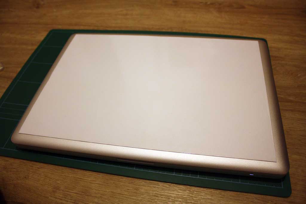
D.I.Y. Laptop-lid Whiteboard
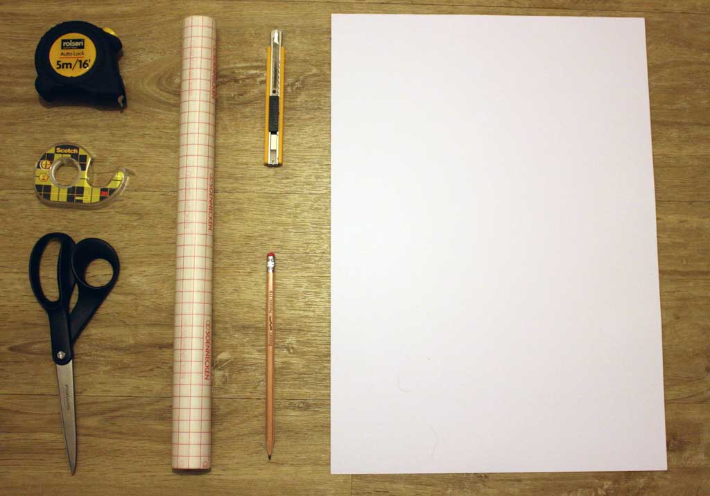
Blue Peter style list of things:
You'll need scissors and/or a craft-knife, double-sided sticky tape, a measuring tape, a bit of sturdy white cardboard or a thing sheet of opaque PVC and some sticky-backed clear plastic. You'll also need a laptop and an grown-up to help you with the cutting.
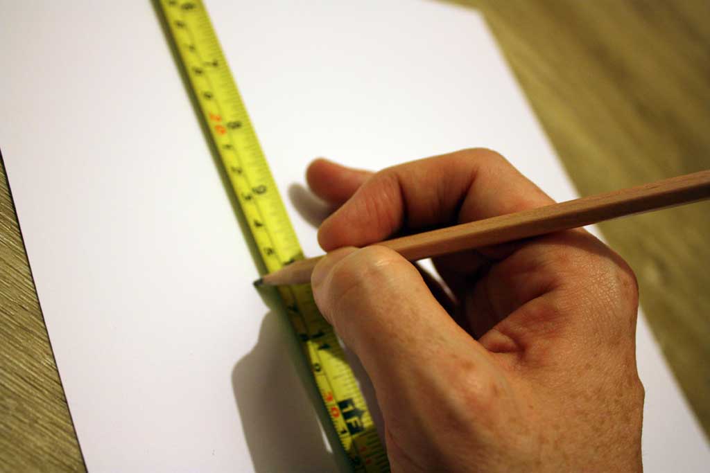
First, measure the top of your laptop and figure out how big your whiteboard can be and draw that on your cardboard or plastic (from now on referred to as 'white board').
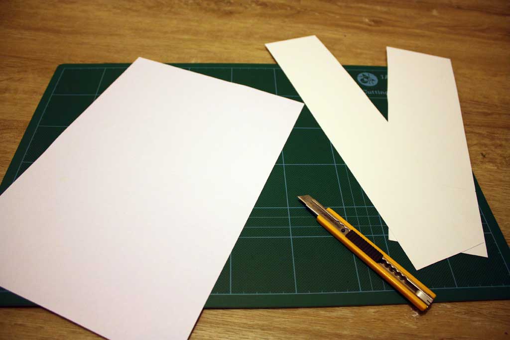
Next, cut your cardboard or plastic to the right size. Remember to measure twice and cut three times or something like that. I can't remember exactly but there some ratio of measuring to cutting. Do that.
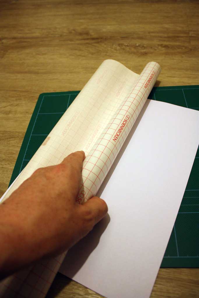
If you're using a piece of shiny PVC or something like that, you can miss this next bit. If you're using cardboard or something else, you'll need to cover it with the transparent sticky-backed plastic.
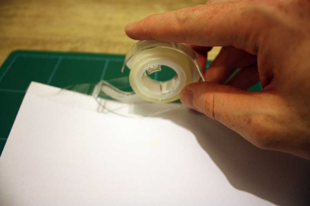
The final preparation stage is to put the double-sided sticky tape on the back and position it on your laptop lid.
Try not to take any photos one-handed while doing this step or this may happen:
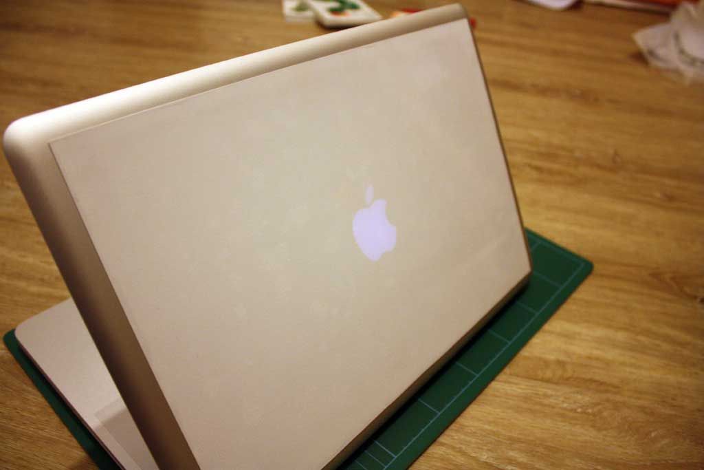
There you go. A portable, take-anywhere whiteboard in 10 minutes. Apart from needing a pen, of course, and a cloth to wipe it so you don't end up with smudges all over your laptop bag, we're done.
I can now take my whiteboard with me everywhere I go for a meeting. Long may the diagramming continue.
While I was making the 3D CSS Mario Kart, I needed a simple, drop-in bit of code to handle touch interfaces. I looked through some old experiments and found a rough version of the code below. It was based on this KeyboardController by Stack Overflow user Bob Ince.
It doesn't do anything clever. All it does is provide a simple way to attach functionality to touch events in different areas of the screen – top-left, top-center, top-right, middle-left, middle-center, middle-right, bottom-left, bottom-center, bottom-right. My apologies to any Brits for the spelling of centre as 'center'. It's the Internet, we have to.
How to use
Include this code:
function TouchController(areas, repeat) {
  var touchtimer;
  document.onmousedown = document.ontouchstart = document.ontouchmove = function(e) {
    var position;
    e.preventDefault();
    e.touches = [{'clientX':e.pageX,'clientY':e.pageY}];
    switch(true) {
    case (e.touches[0].clientY<window.innerHeight/3) :
        position = 'top';
        break;
    case (e.touches[0].clientY>(2*window.innerHeight)/3) :
        position = 'bottom';
        break;
    default :
        position = 'middle';
        break;
    }
    position+='-';
    switch(true) {
    case (e.touches[0].clientX<window.innerWidth/3) :
        position += 'left';
        break;
    case (e.touches[0].clientX>(2*window.innerWidth)/3) :
        position += 'right';
        break;
    default :
        position += 'center';
        break;
    }

    if (!(position in areas)) {
      return true;
    }

    areas[position]();
    if (repeat!==0) {
      clearInterval(touchtimer);
      touchtimer= setInterval(areas[position], repeat);
    }
    return false;
  };
  // Cancel timeout
  document.onmouseup = document.ontouchend= function(e) {
  clearInterval(touchtimer);
  };
};
Now, all you need to do to attach a function to a touch event in the top-left area of the screen is:
I use this for direction control in the Mario Kart experiment which maps exactly onto the cursor keys used for the normal control.
TouchController({
  'top-left': function() {  // UP + LEFT
				drawMap.move({y: 2});
				drawMap.move({z: drawMap.z + 2});
				drawMap.sprite(-1)
			  },
  'top-center': function() {  // UP
				drawMap.move({y: 2});
			  },
  'top-right': function() {  // UP + RIGHT
				drawMap.move({y: 2});
				drawMap.move({z: drawMap.z - 2});
				drawMap.sprite(1)
			  },

  'middle-left': function() {  // LEFT
				drawMap.move({z: drawMap.z + 2});
				drawMap.sprite(-1)
			  },
  'middle-right': function() {  // RIGHT
				drawMap.move({z: drawMap.z - 2});
				drawMap.sprite(1)
			  },

  'bottom-left': function() {  // DOWN + LEFT
				drawMap.move({y:  - 2});
				drawMap.move({z: drawMap.z + 2});
				drawMap.sprite(-1)
			  },
  'bottom-center': function() {
				drawMap.move({y:  - 2});
			  },
  'bottom-right': function() {  // DOWN + RIGHT
				drawMap.move({y:  - 2});
				drawMap.move({z: drawMap.z - 2});
				drawMap.sprite(1)
			  },
}, 20);
If you need anything clever or you need two or more touches, you should use something else. This is just a simple drop-in for when you're copy-paste coding and want to include touch-screen support.