-
-
Application Layers
On recent web app projects in HERE Tracking, I've been using a layered component structure that fits particularly well with frontends that access and interact with JSON APIs.
The primary reason for structuring our apps this way is that it gives us a lot of freedom in our workflow and still fits well within the larger HERE structure with horizontal design teams that align across the multiple products. This works as a way to enable parallel contributions from everybody across the engineering teams.
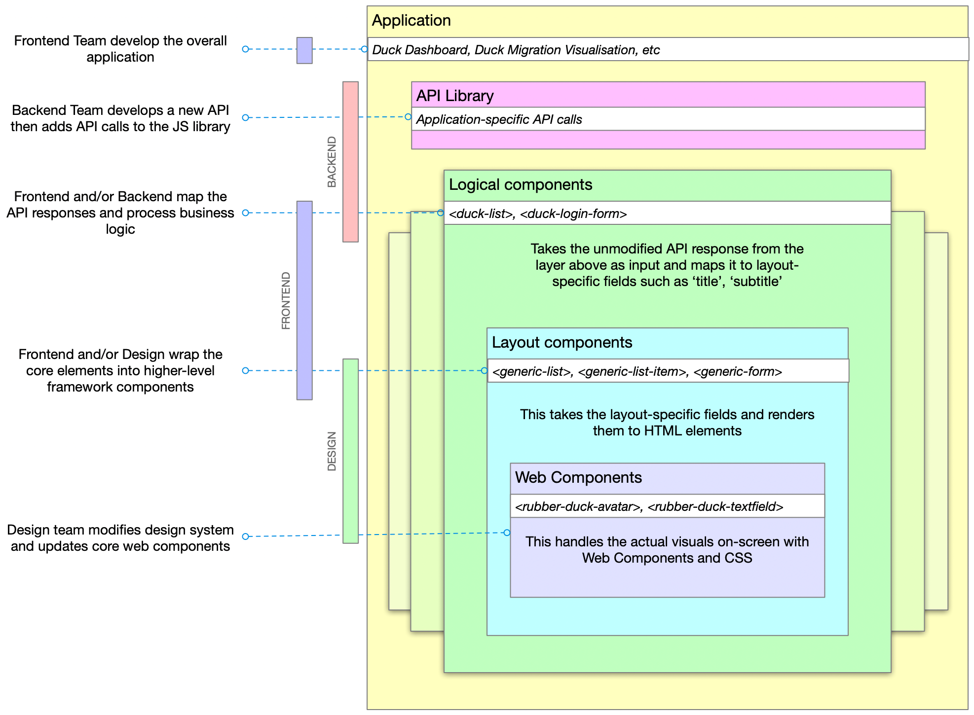
The layers are:
- Application
- Library (JS library to access the API)
- Logical (maps business objects to layout concepts)
- Layout (renders layout components)
- Components (low level elements and design)
And, generally, these layers are within the areas of expertise of the Backend, Frontend and Design specialists.
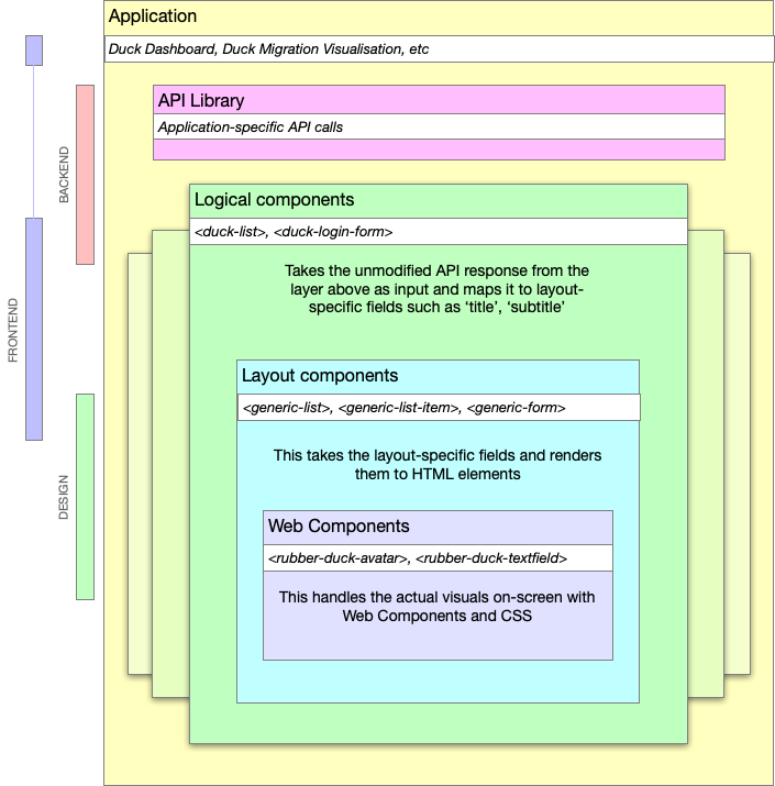
It shouldn't be necessary to say this but just to make sure I'm not misunderstood: it's important to note that none of these roles is limited to the scope below, this is just a general 'areas of expertise' guide. See my previous post about shared responsibilities.
- Backend teams create the API and implement the JS library. If possible, also implement the basic logical component which performs whatever business logic is required.
- Frontend teams build the application out of components, further maintain the logical components and the mapping between logical and layout components
- Design teams implement the core web components and company-wide design system of UX, UI, mental models, etc. This layer can also be based upon an open-source design system such as Carbon or Material.
Of course, the backend team can modify the web components if they have the inclination just as the design team couuld make improvements to the database if they are able to improve the product.
Example
NOTE: The example below is mostly Vue-like but this layered approach doesn't rely on any framework, language or coding style. It's a way to split and share responsibilities.
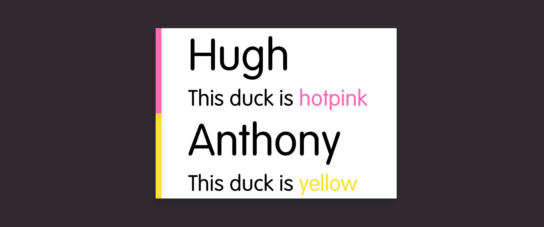
Rubber Duck Inc. make GPS-enabled rubber ducks. They have a dashboard where customers can see the location of their ducks. The dashboard includes an overview list of ducks.
Backend
The Backend team extend the Duck definition (stored in their duck-ument database) to include a new 'icon' field then update the
GET /ducksendpoint that allows you to receive a list of all the ducks you own.Sample response:
{
  "data": [{
    "id": 123,
    "name": "Hugh",
    "colour": "hotpink,
    "icon": "star",
  }, [{
    "id": 321,
    "name": "Anthony",
    "colour": "yellow",
    "icon": "dot",
  }],
  "count": 2
}
They check to see if the JS library needs updating (if they are using automated code generation, this might already be done). It doesn't, it already returns the full
dataarray of the response:fetch(`${api}/ducks`) .then(response => response.json) .then(json => json.data)The data is rendered in the web app using a logical web component
<duck-list :ducks="ducks"/>The engineer digs one step deeper (into the 'logical' or 'application components' library) and sees that the
duck-listcomponent wraps thegeneric-listcomponent but with a few modifications to the data structure.<template> <generic-list :items="items"/> </template> <script> : props: { ducks: Array, }, data() { return { items: this.ducks.map(duck => ({ title: duck.name, subtitle: `This duck is ${duck.colour}`, })) }; }, : </script>And then modifies it to also pass the icon into the
generic-listso that each item looks like:{ title: duck.name, subtitle: `This duck is ${duck.colour}`, icon: duck.icon }Frontend
In a parallel task, the frontend specialist can be improving the
generic-listcomponent. This component doesn't do much except create a set ofgeneric-list-itemelements.<template> <ul> <generic-list-item for="item in items" :item="item"> </ul> </template>Each
generic-list-itemis built from basic web components from the company's DuckDesign language:<template> <li> <rubber-duck-title>{{title}}</rubber-duck-title> <rubber-duck-subtitle>{{subtitle}}</rubber-duck-subtitle> </li> </template>Frontend can then improve this to take advantage of the new data structure. Handily, there's a
rubber-duck-avatarcomponent. That should work here:<template> <li> <rubber-duck-avatar if="icon">{{icon}}</rubber-duck-icon> <rubber-duck-title>{{title}}</rubber-duck-title> <rubber-duck-subtitle>{{subtitle}}</rubber-duck-subtitle> </li> </template>Design
So close, except the alignment's not quite right... Frontend has a chat with design and they decide that, while this could be solved in the
generic-list-itemcomponent (or even in theduck-listor the application layer), having an icon next to a title is a more generic requirement so it should be solved in the lowest design component layer:rubber-duck-avatar + rubber-duck-title { margin-left: 0; }Design tweaks the alignment of the
rubber-duck-avatarcomponent and deploys it company-wide to all product teams. Every team benefits from the shared library, the DuckDashboard team gets to show off their new duck icons, everybody helped complete the product story and nobody got hurt.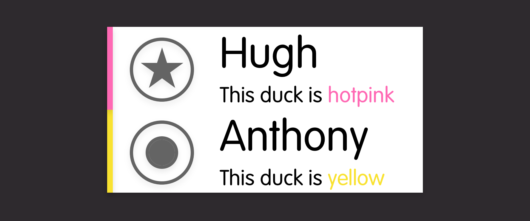
Conclusion
Admittedly, this does lead to having multiple individual repositories for a single application
- dashboard-app
- duck-api.js
- dashboard-components
- layout-components
- duck-design-web-components
But it does give each team the flexibility to contribute beyond their core area and not be blocked by other teams.
Let me know what you think or how you'd improve it. Do you already use an approach like this?
-
Colouring a Rubik's Cube with CSS variables
I was playing around with the flick keyboard from the last post and decided that I could do with a way to draw the cube. There are plenty of existing cube render tools out there (https://codepen.io/Omelyan/pen/BKmedK, http://joews.github.io/rubik-js/, https://cubing.net/api/visualcube/) but I felt like making my own because I needed something to do with my hands while watching the second season of Dead To Me.
What came out was a self-contained web component using CSS variables, fallback styles and calculations to produce a nicely customisable element:
Default cube
<flat-cube facelet="UUUUUUUUURRRRRRRRRFFFFFFFFFDDDDDDDDDLLLLLLLLLBBBBBBBBB" />Scrambled with "M' U F R E R E2 M' U' M' F2"
<flat-cube facelet="BDDFBFUURDRBUUBLDULLFULRDUFLBUDFRDDFRLBRDFLLFRFULRBRBB" />Same again but with different colours:
:root {
    --flat-cube-up: blanchedalmond;
    --flat-cube-left: orangered;
    --flat-cube-front: lawngreen;
    --flat-cube-right: rebeccapurple;
    --flat-cube-back: dodgerblue;
    --flat-cube-down: darkslategrey;

    --flat-cube-inner: white;
    --flat-cube-outer: white;
  }
}
The configuration of the pieces is defined by a "facelet" string. This is a way of representing a configuration of a 3x3 twisty puzzle by enumerating the faces like this:
             +------------+
             | U1  U2  U3 |
             |            |
             | U4  U5  U6 |
             |            |
             | U7  U8  U9 |
+------------+------------+------------+------------+
| L1  L2  L3 | F1  F2  F3 | R1  R2  R3 | B1  B2  B3 |
|            |            |            |            |
| L4  L5  L6 | F4  F5  F6 | R4  R5  R6 | B4  B5  B6 |
|            |            |            |            |
| L7  L8  L9 | F7  F8  F9 | R7  R8  R9 | B7  B8  B9 |
+------------+------------+------------+------------+
             | D1  D2  D3 |
             |            |
             | D4  D5  D6 |
             |            |
             | D7  D8  D9 |
             +------------+
For example, a solved cube is represented by:
UUUUUUUUURRRRRRRRRFFFFFFFFFDDDDDDDDDLLLLLLLLLBBBBBBBBBWhile the scrambled version shown above is:
BDDFBFUURDRBUUBLDULLFULRDUFLBUDFRDDFRLBRDFLLFRFULRBRBBI chose this representation purely because I've seen it used in other cube modelling projects.
In my demo page, I include the https://github.com/ldez/cubejs library and use that to translate move strings into facelet strings. It would be possible to include this directly in the web component and would improve the usability at the cost of a bit of extra complexity inside the component. That would allow using the component like this:
<flat-cube moves="M' U F R E R E2 M' U' M' F2" />Which does look nicer.
Style
Throughout the component, I have tried to use CSS variables and the calc function as much as possible to allow the component to be restyled and scaled as needed while offering sensible fallbacks.
For example, the styles to define a face include a calculated size with a fallback:
:host {
  --flat-cube-face-width: var(--flat-cube-face, 100px);
}
.face {
  height: var(--flat-cube-face-width);
  width: var(--flat-cube-face-width);
  outline: 1px solid var(--flat-cube-outer, black);
}
While the faces each have a CSS variable to allow styling them along with a fallback:
.U-piece {
  background-color: var(--flat-cube-up, #ebed2b);
}
In action
-
Rubik's Keyboard
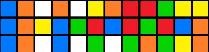
For anybody who has a bit of a technical, problem-solving mind (I'm going to guess that's literally anybody reading this), there's a high likelihood that you have not only played with or owned a Rubik's cube but also attempted to solve one using a step-by-step guide.
Notation
Most guides are written using 'Singmaster Notation' where F denotes a clockwise rotation of the side facing the solver, U' is an anticlockwise rotation of the uppermost layer, and so on.
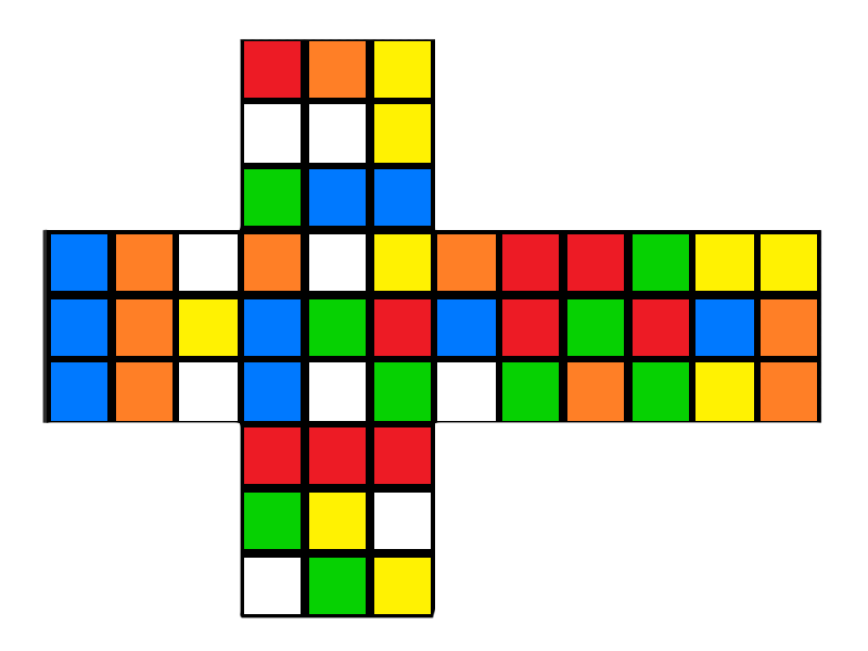
This notation is used to describe not only solving steps but also scrambles when applied to an already solved cube. The following scramble, for example:
L R' D2 U' B D2 F2 D F' L2 F2 R' D' L R2 D U2 L F' L' B2 D U R2 F' D' L' R D2 UProduces this:
Kana Flick
In seemingly unrelated news, the standard way to type Japanese characters on a smartphone is using a Kana Flick Keyboard.
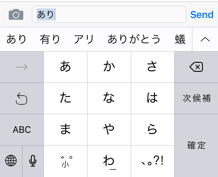
This style of keyboard groups characters together so that you essentially touch the key to select the consonant, move in one of four directions (or stay still) to select the vowel and let go to confirm. Put that way, describing it takes a lot longer than actually doing it.
Rubik's flickboard
This is a long preamble to say that I was thinking through a new game design the other day when I had an idea about a variation on the kana flick keyboard that could be used to enter Rubik's cube move notation:
Note: It doesn't yet include 'fat' moves (lowercase variations which denote moving two slices of the cube rather than just one),
E,Sor rotations (x,y,z).It only works on iOS for now because it was a Sunday-evening sofa hack while rewatching Voyager on Netflix.
-
Toast Guide
Ever needed a handy chart to guide you through the complexities of toast?
Thought so.